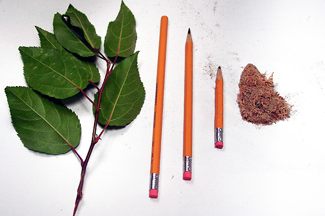
The "mess" around the last pencil was actually intentional, I wanted it to look like it was "bleeding". Unfortunately, it just came out looking sloppy. Oh well..
Feel the need to see more of the circle of life b etween the twig and the unsharpened pencil... i like it anyway.. wish it were cleaner around the smalles pencil 5 sjgleah
I like this idea - clever. I like the contents and the composition. (I'm being straight forward - NOT to offend) 2 small things that I would adjust - the lighting and the background. For me, white backgrounds are difficult to achieve. Still - I can appreciate the time and effort put into this. Good work. Ruthann
Very creative. You even wore the eraser down. lol. There were so many great photos in this challenge, but also a lot of very similar photos. I like how yours is different. The lighting is great and the color of those leaves is excelent. You must not be from Michigan cause all our leaves here have been eaten by bugs. The only suggestion I would have for this photo is to try to get the pencils and the stick either more vertical, or more diagnal. It's off so slightly that it looks like you tried for vertical, but missed. Still a really great photo. Good luck in the challenge.
I don't like to see the name of the challenge used in the title... it would have been just as effective, maybe more because it would have made the viewer think a little more, if it were just titled "Circle of Life"
Composition - quite good Technical Aspects - very good Meets Challenge - yes Visual Impact / Originality – high/very good Other comments – lead "dust" at top bothers me a little.
Nice idea. One thing I think would be nice is if the pencil shavings were blowing away. I'm not sure how it would look in practice, but it's an idea to consider. Also you might want to try to get the background closer to true white.
I realise it would probably be hard to keep clean, but the dust/ graphite on the white background is distracting. Nice idea but not very visually exciting/ stimulating
In my opinion this is a very good idea. BUT the execution kills it. Why is the background so dirty? also ithe angle is kida weird and why didn't you have the last part a bit more aesthetic. I think it could've gone from good to great.






 Add photograph to your favorites
 Add photographer to your favorites


