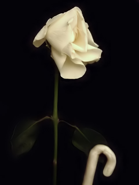
The rose was a lovely present from my flatmates, now sadly getting past its prime.
Editing: contrast, hue, saturation, darkened the background, USM, neat image.
***Post-challenge:
Hmm, forgot to take into account cultural differences...
'OAP' stands for 'old age pensioner', which in Britain is an extremely commonly used abbreviation (up there with 'DIY' and 'lol' in its obviousness). Hence the old rose with the walking stick was meant to be a quirky representation of the meaning of the acronym, which I expected everyone to know. However, for voters from, say, the States or Australia, that doesn't really work... I did like the guesses people came up with though :)
Statistics
Place: 182 out of 201 Avg (all users): 4.6691 Avg (commenters): 4.0000 Avg (participants): 4.3750 Avg (non-participants): 4.9200 Views since voting: 969 Views during voting: 235 Votes: 139 Comments: 6 Favorites: 0
"OAP" is defiantly an acronym that I did not understand but I do live in the States. So after reading your comments it makes a lot more sense. I thought maybe it was a DPC joke I had missed in the forums.
I like that your were shooting with a soft feel for the rose, I think that works well. I think also that your lighting is extremely good, the background looks very deep and black. I think maybe if the focus was a little stronger it would have helped with the overall score. Honestly I wasn't really sure what the object on the bottom of the photo was until till I read your description. Overall the idea was very creative I wish more of us had known what OAP meant.
Things I Like: Soft focus on petals and leaves works for me. Contrast between stem, petals and background works well.
Things I don't like: I don't like the candy-cane looking thing at the bottom. I don't like that I see dodgeing in the background around the leaves and stem. I'm not too crazy about the composition.






 Add photograph to your favorites
 Add photographer to your favorites

 Photographer found comment helpful.


