Challenge:Pencil (Classic Editing) Camera:Nikon Coolpix 990 Location: Santa Clara Date: Aug 15, 2002 Aperture: 8.3 ISO: 100 Shutter: 2 seconds Date Uploaded: Aug 18, 2002
Many thanks to all the kind and encouring comments I got. As this was my first time ever to submit a photo to any kind of competition, I'm honored by the reception it got.
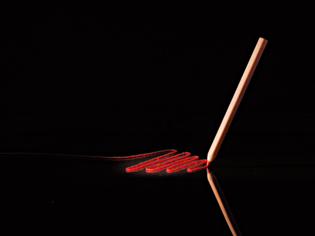
Since so many people asked me what this is or how I did it, here goes:
First I've got to say that this picture works a LOT better with a black background. The black part is not uniformely black. In low light settings you can actually see light cone around the pencil and also the shadow under the pencil. I could even see my average fall lower during the day and increase again in the evening. I wish they would change the picture pages to use black background. IMHO that's better for every single picture. With this bright white background you're losing all detail in dark areas of any picture.
The scribbles are thick cotton thread. The whole thing is setup on a dark blue foldable mattress, with a part level and the rest propped up against the wall to form the background. I put the glass from a poster frame on the level part of the matress as reflective surface. I had to wet the thread to make it lay flat on the glass.
The lighting was a bit tricky: I used one spotlight (a regular desklamp with a cardboard tube held in front of it to focus it on one spot) to light the scene from the left side. Since the scribbles needed additional light to keep the balance with the pencil lighting, I used a second spotlight directly from above for that.
In response to a few people questioning the relection of the framing, I do not agree with any of these. The picture would be dull without the relection and it wouldn't work as well with a different vertical framing as far as I'm concerned.
Yes, the focus is not great. That's did probably cost me some rating. I am aware of that and believe me, I tried. I have several theories why that is, but I'm not sure which one is right. Whatever it is, focus is the weak spot of any consumer digital camera. The autofocus is too often wrong, and manual focus is useless because you can't judge the sharpness without a real viewfinder. This and shutterlag will be the main reason for me to upgrade to a DSLR before long.
Nice photo. I like the red line. What is it? I don't know about the reflection, can't say if the photo is better or not better with it. Good composition and very good lighting. The pencil is a bit unsharp. I don't know if you did it on purpose but more sharpness would be better in my opinion. -stephan
very nice idea, and nicely implemneted. i have no criticism to offer, just a small nitpick - there's a dot in the lower left corner. your photo is in my top 10 this week. -- gr8photos (9)
Again I am impressed with the creative imaginations here at this site. I like what you did here! The lighting, composition, color for mood... it all works! Very well done... P.S. It`s a "why didn`t I think of that"...
There is mostly good taste in this elegant composition, which surpasses the technical aspects, and makes it a very atractive and original image. My favorite for this week.
Good job of getting the reflection without any glare. I find the composition simple and well balanced. I think it is artistic and creative too. Good job! (10)
Composition - very good Technical Aspects - very good Meets Challenge - yes Visual Impact / Originality – high/very good Other comments – great idea, well done. Top pick for me.
Nice use of color, lighting and framing. There is one bright spot in the lower left hand corner, but I'm not deducting points for it, since it could be easily removed if the rules allowed spot editing.
Excellent work! very well executed. I enjoy all of the black space - very appealing - there's something gentle about this. Someday I too will be able to do such work. :-) It is very very apparent that this took a lot of time and effort. 10 Ruthann
lovely photo! The reflection adds so much to this shot... This shot holds a lot of nice visual impact, and yet it is simple and straightforward at the same time :) great shot... = 10 - jmsetzler
Very attractive. Lighting, angle, ROT all good. What was your reflective surface? I can see a little reflection behind the upright pencil also. =9 syamjonimi
very nicely set up. I feel this could be better vertically framed, capturing the full reflection, and having a more symmetrical feel. A good attempt but could be improved I think. Like the hidden support feel.
Like it a lot. Here's what I would've done: center it and then have the reflexion come out of the right lower conrner and the actual pencil from the top. Just an idea...
Fascinating shot – the lighting creates a surreal atmosphere to a surreal shot. If this had been just a tad sharper I would have given it the max… It's inventive, it holds the attention and it makes you wonder – how did you do it? Great shot (9)
This is a very creative idea and nicely executed. I wish the scribbles were a bit more in focus. I can't really see what's going on there. It kind of looks like paint, but I think that it could be because it was dont on a mirror. Lighting turned out great. The bottom pencil almost looks a bit distorted, but as I look closely, it's just heavily shadowed on the non light side. Practically unavoidable. Great shot. This one is on the higher end of my voting this week. Congrats and good luck with the challenge.
thats really neat! i would really like to know how u got the pencil to stand up like that. i love the reflection from the pencil but not from the scribbles..id like to know how u did that also...great photo!





 Add photograph to your favorites
 Add photographer to your favorites


