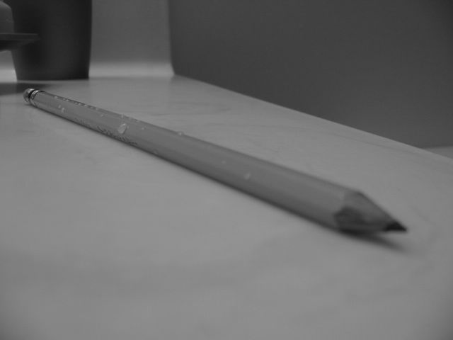
You've got a narrow depth of field but Im struggling to see what you were trying to focus on. I think a little more contrast and light would have helped.
Original thinking to have the focus on the back end. Somehow it just doesn't appeal to me however - may to busy background so you drift away from the pencil itself. 6.
I'd rather see the tip of the pencil in focus and the back out of focus. I put this in photoshop and i like it much better with more contrast and brightness.
I like the idea. I have tried something similar, but it is quite difficult to decide where the focus should be. I like the drops as they break the smooth surface of the pencil. Maybe a bit too dark.
Um.....I'm not a big fan of using the challenge category in the title and you did it 3 times. There is some good distortion factor going on here, if it were a little lighter and better focus would help me with this score. syamjonimi ;'-(
O.K. it's a pencil.....I don't see why the soft focus on the tip, don't understand the water? droplets on it. Low appeal/interest. 5 Confused A.K.A. Swash
It looks like a very long pencil. Is it the perspective or is it a very long pencil ? Two problems for me though: the tip out of focus, and the lack of white and black (I'm sure there's a technical term for this).
I like the idea, but find this too grey and too dark. I like the unusual DOF where focus is at the back of the pencil not the front, it kind of pulls you in. The variation in the background confuses me, I can't figure out what it is. Kavey
Yup, it's a pencil. but unless I'm missing something, that's all it is. Focus is a bit soft for my taste, but that's just an opinion. Visual appeal is pretty low. Lack of color, background and creativity makes me think it was a last minute submission?? However, the angle is very nice. Makes it kind of look like a long skinny pencil. Good luck with the challenge.
This photo needs some contrast... there is not enough tone variation here... the point of the pencil being out of focus doesn't work well for me either. Maybe if the lighting was stronger, the extra contrast would be here... - jmsetzler
Black and white might have worked nicely if the photo had some real lights and darks, but everything being equal, you ended up with a very gray photo. Also, I would like the point to have been in focus, but then perhaps it wouldn't have had the illusion of depth that it currently does. 5





 Add photograph to your favorites
 Add photographer to your favorites


