I don't understand your comment, nor do I understand when you say this is an insult to the heroes who fought at Iwo Jima (in your previously sent message). Can you explain yourself please?
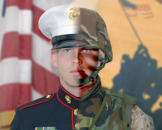
Thanks for the compliment sacredspirit. I really like this shot, and it captures my Marines' capabilities (they worked for me overseas; hence, the "my Marines" comment). So thanks again.
Thanks for the compliment sacredspirit. I really like this shot, and it captures my Marines' capabilities (they worked for me overseas; hence, the "my Marines" comment). So thanks again.
The project looks amazing. I've tried these, and I know how difficult they can be, so props to you because this looks awesome. Maybe a lil more saturation on the background wouldn't hurt.
This is so effective at communicating the intended point. Sorry about your DQ but since you asked for comments I'll tell you how it strikes me. For starters, as I said, I think it has great impact. I probably would have scored it a 7. While I like the blending of two images in the subject Marine, I don't care for it as much in the background. In my opinion having the American flag on the "dress blues" side and the raising on the flag on the other gives me just too much to look at, 4 images instead of two. Also the colors in the complete image have a bit of a washed-out look to my eye. I hope that you will find these thoughts helpful, and thanks to you and your friends for your heroism, sacrifice and service. Best, Ray




 Add photograph to your favorites
 Add photographer to your favorites


 Photographer found comment helpful.


