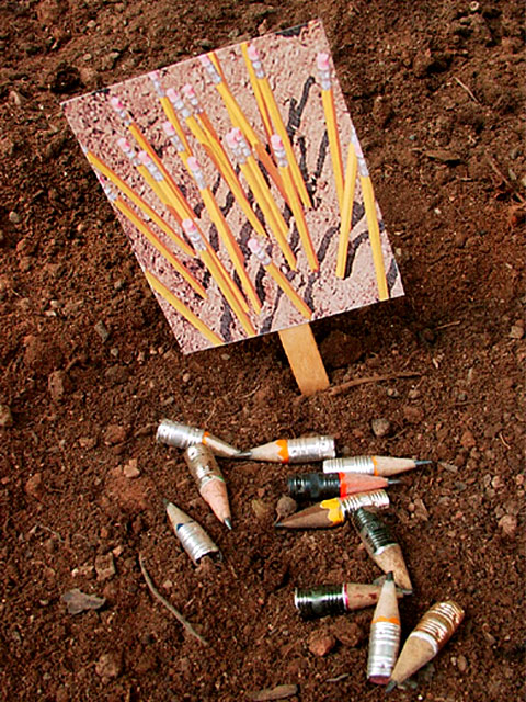
I was surprised at the number of garden pencils we got this week. I very much like your idea of the placard, but less good on the pencil arrangement on the ground. Very funny. (just because other's thought of a similar idea, don't put up with any cliche comments...good job!) 8 Swash
very strong concept. foreground is too soft for me. i think maybe you could have added more color by using red or blue pencils instead of the yellow on the stick. way to be creative. 6
This is a clever idea and I like that you've had to take on photo for use as the "plant" information card within this one. Composition doesn't quite work for me. Are there outtakes with differing compositions? Would like to see any. 5, Kavey
This is adorable. The message is really clear. Even without the title it is great. Focus is a bit soft on the pencil seeds, but that does't take anything away from the photo. Lighting is great, angle is good. Maybe could have tried it with the sign a little more vertical. Overall great shot. Good luck with the challenge.






 Add photograph to your favorites
 Add photographer to your favorites


