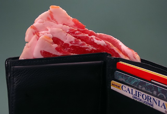
Like the idea - something lets it down though photographically. Not that there's anything specifically wrong with it technically, but I think perhaps the composition is too arbitrary: why not show all of the wallet? Why have the driver licence so prominent? Actually you've ended up with the bacon dead centre of image - I can imagine this much stronger if you had the entire wallet in shot, opened symettrically toward the lens, with the bacon sticking out at exactly the same angle. Nice effort though.
ROFL Some of you guys are nuts! I love the humor!
The thing working against this photo is the background - the color isn't very flattering and doesn't work with the subject. Kudos for making me laugh! :D
I had a good chuckle when I saw this photo. Great literalism portrayed. This picture is perfect. Great idea, great composition, good definition and color. I don't see one thing wrong so as far as I'm concerned you have achieved perfection. A 10 for you!





 Add photograph to your favorites
 Add photographer to your favorites


 Photographer found comment helpful.


