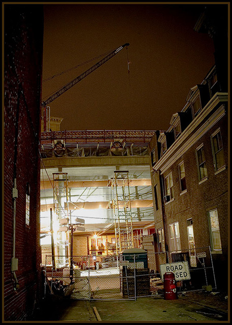
I like the lighting, contrast, and composition. The subject matter is not very interesting or pleasing. The tilt is distracting and doesn't seem to add value to the composition. That's why I only gave it a 6.
I'll give it a whirl - I guess the first thing that strikes me is that it makes me wonder if I am still feeling the effects of my celebratory Frday night cocktails. That said, I think I am not, and the picture would benefit from a more horizontal orientation and crop. But I like, very much, the way I am drawn to the well-lit center of the photo, but then I am distracted by the crane overhead. I also feel like the building on the left is obtrusive, cutting off the scene I am trying to see. Maybe that's a good thing - creates some tension for hte viewer. I like the theme of the photo - the surprise of the activity in what I feel is a dark, quiet, empty street.
Okay - critiquing is hard. I really feel like I don't know what I am doing, but I feel like I should try. I wish we had a forum for critiquing critiques.
Let's see now - Alfred Hitchcox was forever tilting the camera to bring out the oddity/scariness etc in a scene. Whether or not you intended that, it hasn't worked here for me. I would have used the horisontal floors or the roof line for orientation and cropped to that. That's one of my pet peeves though, so it may be worth ignoring.
The area under arc lights is effectively blown out. I think that works against the theme of the picture. It's good for the construction workers, but to put over the idea of night work in a picture, maybe it would be better that the work were more poorly lit, and the shadows more obscure.
There's a little (exaggerated?) application of my thoughts there.
I think it needs to be a little 'wrong' to bring out surprise feeling you had (?) when you stumbled on the scene...








 Add photograph to your favorites
 Add photographer to your favorites

 Photographer found comment helpful.


