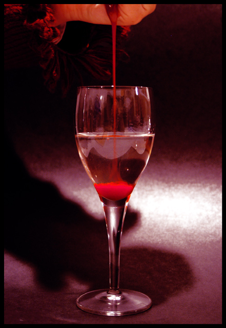
Ewwww, nasty! But an excellent literalism, and very well presented, photographically. The only things I'd change are maybe using a polarizer to cut the reflections in the glass.
The substance flowing down looks a bit like chocolate syrup but the reddish pink color in the glass just doesn't look natural or like blood, it is too pink and bright, nice idea though, alos would be better without the shadow and the reflection on the glass. 5
Good literalism. I think the hot spot in the background really detracts here, as well as a couple other smaller factors. I don't think the centered composition is very dramatic here, as is the subject. Also, I wonder what the object is above, there's a little there, so it attracts my attention, but not enough to really see what it is. I think this might have worked well just as a close up of the separated liquids, focusing on the lighting and colors to give it some snap!
Interesting idea and I like the fact the 'blood' is at the bottom of the glass. What appears to me as ruffles near the hand also adds a nice period mood to the image, something straight out of interview with the vampire or similar. Hrm, the thing that is distracting that I realise you had no control over without editing is the reflections on the glass. I've found that glass is an amazingly annoying thing to shoot. I think the shadow of the arm detracts from the glass, and other than playing around with the lighting, which probably would have caused more glass reflections, I'm not sure what else you could have done. Also the background is a little odd. I cant tell if you oversaturated it with an editing program or what, it certainly looks like what happens when you do that. For a dark mood the white seem out of place and a bit glaring. It that was the result of your light source then you probably needed to rearrange your lighting. Technically it has some flaws, but I do like the mood that comes across with the image.
Nice work. Colors are nice, focus, composition and lighting great.
I am not too fond of the background, it seems a bit pixelated or oversaturated - but not to the point of making this unattractive photo, because I think its a great shot.
Very cleverly done and great interpretation of the challenge. I find the white area middle right a little distracting, but that is a very minor critism. Nice work.





 Add photograph to your favorites
 Add photographer to your favorites


 Photographer found comment helpful.


