Greetings from the Critique Club
Good idea.
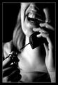
I think that the only really major issue I can find here is the tight crop on the right. Just a bit more open space on that side would help define the apple.
I do like the stethescope blurred, but maybe not quite as much. A little more definition could help.
I like the idea of using a high key treatment. The clean, sterile look associated with the medical profession. Another light shining or reflected on the foreground would help eliminate some of the grainyness there.
All in all a good effort.
I hope this helps.
peace,
JC |







 Add photograph to your favorites
 Add photographer to your favorites

 Photographer found comment helpful.


