Thinks for the nice comments and I´m glad that I got number 32. So I´m still climping up towards the first place. I´m doing a lot better this week. Again Thanks everybody for liking my work
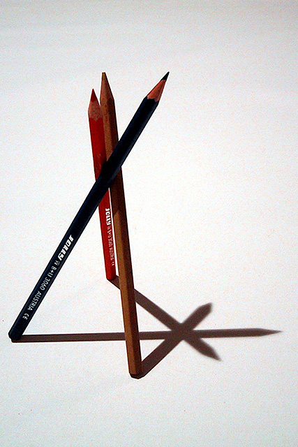
This one would have benefitted from manual white balance or some more careful postprocessing. I find the grainy background disturbing. I also wonder if shooting it from approximately the same angle and the light would have looked better... 6.
I love the idea and composition of this, which is where it gets the score from. Technically I find it a little dark, could do with more light and more vibrancy of colour. Is the graininess deliberate affect? Wasn't sure. 6, Kavey
This is a great example of a simple design shot that was very well executed! Your star didn't line up exactly the way I envision it, but this is still one of the most clever ideas in the challenge this week. Nice thinking!!!! 9 Swash
The shadow in this is great. The lighting is just perfect fot this. I like the angle. I wonder if it would look the same with bright colorful pencils? colorful pencils might draw attention away from the star. Very clever idea. Great shot and good luck in the challenge.
Great job. How'd you get them to stay - I tried crazy glue and it wouldn't stick! (only stuck to my arm lol) Nice job here - I like the composition. One small thing - I'm liking the white - seems a little on the grey/grainy side (but could be me). Still, great work!. 8 Ruthann






 Add photograph to your favorites
 Add photographer to your favorites


