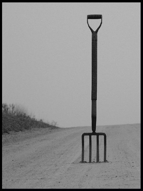
I like the shot but...... I don't like seeing the side of the road on the left, without seeing the opposite side as well. Maybe its because I am used to seeing the (almost) cliche' image shot down the middle of the road. I do love the B&W treatment, and the slight grain.
Good idea for the literalism challenge and well executed. The only thing is that the edges of the fork don’t seem very smooth, maybe due to high jpeg compression?
Simply the best of the lot. Great idea, image, angle, lighting...
You should give up your day job - or have you already. HA!
Keep up the good work.
Prof. M.
This is good and very funny. I can just imagine someone giving directions and actually meaning this type of fork in the road and yet our conceived notion assumes the other. It's very simplistic and stark, not sure if you added the grain/noise or it's natural, but I like it. Contrasts are good, composition is good, I like the addition of the grass bank on the left. Good idea!
lol - great idea! Great use of b&w, I like the border and composition. There seems to be some grain, but that might have been intentional. Well done :-)
hahaha excellent humor, and picture! Nice job. I would like to see the sky a bit whiter to create more contrast, and perhaps have the fork almost all black







 Add photograph to your favorites
 Add photographer to your favorites

 Photographer found comment helpful.


