|
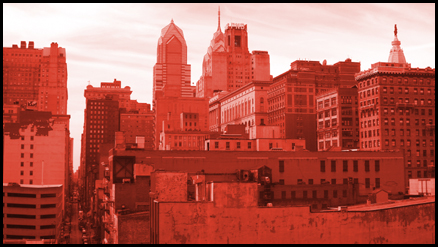
Hrm, an unusual duotone for a cityscape, but obviously purposefully done to reflect the title. It seems a little small, not sure if that's the full 640 pixels allowed or not, and I think that lends itself to making me feel very confined or cluttered. There is also not much contrast between the buildings and so I think that could be another reason why they just feel clumped together. Finally, I realise there was a point to the color, but it just feels unnatural and so my instinct is to not instantly like it. Maybe a red tint with more contrast would have been better received, not sure. It's not horrible, it's just not really grabbing me. |






 Add photograph to your favorites
 Add photographer to your favorites


 Photographer found comment helpful.


