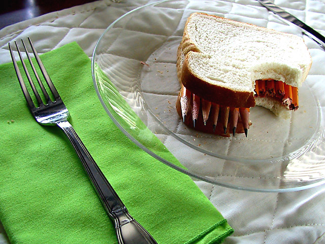
Yes, I know about the highlights on the right side of the sandwich, but there wasn't much I could do about it and get the light the way I wanted it (well, at least not with my setup). I used a white board to try to get some more light on the pencils, but as you can see it didn't work so well. The shadow is there on purpose, to make the sandwich stand out more, but I can see why some people don't like it.
this is excellent :) It's definitely one of the more creative concepts I have seen this week. It falls outside the ideas that I thought of for sure :) The color in the green napkin is very nice... the 'pencil' sandwich looks like the pencils are supposed to be there :) great work :) - jmsetzler
This is my favorite photograph of the week. I initially rated it a 9, but will now bump it up to 10. On Tuesday I was eating lunch while voting, and your photo appeared on my screen just as I was biting into a sandwich. I almost choked! Very creative idea, wonderful composition. The white bread seems to lose a little detail because of the exposure, but overall giving you extra points for the creative idea and the composition. LanSnake
Funny idea! I even like the crumbs on the napkin, but I do think the quilting of the placemat is distracting. A solid background would have been effective. Secondly, although I especially liked the clear glass plate, extra care should have been taken to prevent the glare on the glass.
I understand the need for fiber, but is that really necessary? ;-) The lighting is pretty good, and most of the replections work well. The shadow across the plate, however, is a bit distracting.
LOL. very humorous image. i take it u used natural light. i think i want to see some more light on the pencil pts. use a reflector perhaps? pievce of white board
interesting idea. but it looks a bit crunchy for my taste. the blown highlight on the sandwich is distracting, but overall i like the composition. well done. (6) ~mcmurma
Pencils. Does a body good. Set up is great. I like the creativity here. Lighting is good, however the bread to the right side is a little bright. Not overly bright, but I wouldn't want it any brighter. Reflections in the plate and fork are subtle enough that they aren't distracting. The angle is ok. I'd like to see it at a more flat angle also for comparrison, but then again, it might be a bit boring and plain at a flatter angle. Great job and good luck in the challenge.
Nicely done. If I was going to be picky, I'd say that the lighting on the sandwich isn't very consistant. Kind of bright on the right side. But I'm not that picky. 7
The pencils in the "bite" look like you really ate them! Clever idea. The napkin is a good touch as is the white placemat. There's nothing like it in the challenge - congrats on your cretive treatment!
Yuck - I don't want to know how you got this arrangement - Yes I do - No I don't. I love the idea. I would like to see the picture a bit brighter. The fork is dark - and there is a mystery shadow across the plate that is unfortunate (7)
A very cool idea, well set up. Nothing hugely wrong in my eyes, so I'm going to nit pick you a bit. The bread is slightly blown out on the right, the lower crust is a tad too dark (hey, decide what you want, lighter or darker! That's a comment from you to me....) Not thrilled with the crop, but no ideas how to make it better. 9 Swash
Original idea and I love the way the broken pencils show the "bite" mark. Would try and lose the dark edge at the top left and the knife, or put it with the fork, where it is it just looks like a dark line. 5, Kavey
I love the idea! The shadow falling over the sandwich is a little distracting, as is the table at the upper left. The green napkin adds a nice bit of color.
This is wacky! What made you think of this. All I can remember is my college modern art professor saying "and, *why* did you choose to make a giant sized tape dispenser?". My answer: "why not?". So, in the spirit of modern art and unique composition, I give you an 8 because the highlights on the right are a bit over exposed. - that fixed would make this a 9 in my mind. thanks for sharing!





 Add photograph to your favorites
 Add photographer to your favorites


 Photographer found comment helpful.


