|
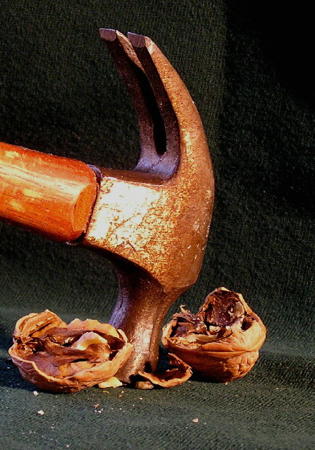
The idea is good but there are a few technical things that I think could be improved on. The background - it has texture, but I think in this case you dont want to distract from the texture of the nuts and the hammer. There are also creases in it that dont add anything to the image. The hammer/nuts are also a little too close to the back of the fabric and so there is a little too much focus on it. The hammer - it's aged, which adds character, that's good, howeve, either there are too many scratches or the light is pointed too directly at the head. The bright white is too distracting and loses the uniform color tone otherwise present. The angle and crop of the hammer could probably have been improved too. Suggestions - either shoot it in mid-swing, or put more of the handle in the frame and perhaps having it coming in at a diagonal from the upper right. The nuts are good, but the splintered shell parts just clutter up the fabric and look like flecks/spots. |





 Add photograph to your favorites
 Add photographer to your favorites


 Photographer found comment helpful.


