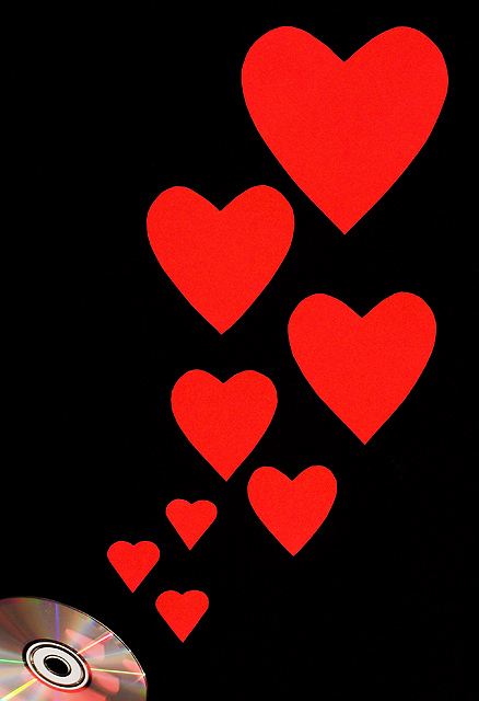
from the team member -- I love the boldness of this and the composition. I like how the eye begins at the CD and follows the hearts up and through the frame. I also like the reflections of the hearts in the CD
from the SC member -- the comment isn't "valid," in that it isn't true, IMO, but it doesn't violate the terms of service, and as a general rule, we try to not regulate (censor, whatever word you chose) those.
The concept behind this idea is great Natayla!! But I think both you and I know that it could be better. Speaking of better, when you do get better (and you will) I think this is a wonderful concept to revisit and reshoot. The main problem with this is that the hearts are all flat and one dimensional. Mayhap staggering some nearer and some a tad further so that you can get some DOF in there. I really like how the hearts are reflected back in the CD because it strengthens the connection between the two main objects. The other thing that you could do to give the hearts more dimension is make some not quite so symetrical AND add a little color variation/shading. The shading can be relatively easy just use a slightly darker shade of red paint and a sponge and lightly dab all over the hearts.
Crap is crap is crap... oh wait... no, that's not right... :D lol. Bleh, don't worry too much about it. Did you take a look at his crap??? Boy, talk about the pot calling the kettle...
I actually liked this. Thought it was delightfully, overly corny! ;)
I've seen a few of these shots around in the forums, and I still feel like this sits on the border of feeling like a photograph to me. It's a nice composition/setup, and the title matches well with it.
Without trying to sound like Am. Idol's Simon C... I think you could do better than this. The idea was okay, I just don't like the final product. Sorry!






 Add photograph to your favorites
 Add photographer to your favorites

 Photographer found comment helpful.


