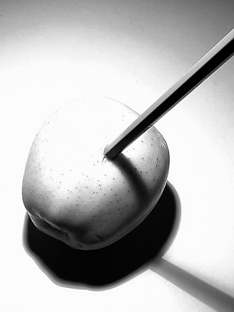
Used this week's challenge to experiment with my camera's exposure bias settings, and also shutter priority mode. I'll probably get some comments about this photo being overexposed, but I like the range between the bright white and shadow areas in this photo. Exposure bias setting was -0.70 for this capture. Used Photoshop channel mixer to create the black and white version, also crop and sharpen in Photoshop.
Statistics
Place: 39 out of 185 Avg (all users): 5.8902 Avg (commenters): 6.3333 Avg (participants): 5.8939 Avg (non-participants): 5.8864 Views since voting: 1321 Votes: 264 Comments: 25 Favorites: 0
Thanks for all the great comments. The blemish in the top center is a pencil marking on the paper backdrop. Over the course of the week I had taken approximately 200 pencil photos on this paper work-area. Some of my experiments used many pencils (40+), so by the end of the week the paper had several light pencil lines. My submitted photo was taken very late at night. I should have placed a new sheet of paper down, but didn't think of it till the next day when I noticed this marking in the photo. It was a very faint marking on the paper, but brought out in the final image because of the over-exposure (the over-exposure was intentional).
I re-looked at this photo at 10pm Sunday night. Good thing some of us are addicted to this site, huh? I originally scored it quite low because the idea simply doesn't appeal to me (actually for some reason it bugs me), but in reviewing my votes for the week, this stood out as one that was not really fairly judged. The lighting is quite well done. It's obvious that that was your intent and you deserve to be judged for the artistic merit. i particularly like the shadow on the pencil. I've changed your vote to a 6.
This photo is my favorite of the "Pencil" challenge. If it weren't for the blemish in the top center (hair? anomaly in the paper?), I'd have given this a 10. I like it so much I might have even let that go, except the picture speaks strongly to me on the concept of "pristine," and I was compelled to be a stickler.
Realizing that this photo is called shadows and light, I will only say that excessive shadow and bright spots don't appeal to me, however, for your purpose, you did a very good job with it. I love the angle of this and how the pencil kind of jumps up and smacks us in the face. great focus and overall nice photo. Good luck with the challenge.
great black and white. the highlights are blown out and i kinda like it that way, makes a nice visual. i dont think it would have the same appeal if it was toned down. well done. (6) ~mcmurma
Unique - different - not something I thought of! Perhaps I don't quite understand the point (no pun intended) - but, I very much like this. The use of light and shadow is excellent in such that is displays so many tones (ref to A Adams). It has a drastic value to it (extra exposure), yet is also a little subtle. Be interested to know if this was accomplished w/in the camera, or was a little tweaking necessary. Great work and effort 8 Ruthann
How funny, one of my attempts at the challenge was to stick a pencil in an orange. :-) I wish the top of the apple didn't disappear, but maybe you did that intentionally. Still, a good shot. 6
This is cool. After looking at so many illustrations, I was really expecting that the apple would be a drawing. Works well with the overexposure - adds drama.
a bit too overexposed, so you've lost all the more interesting textures on the top side. Could do with some fill/ reflected light to lighten the shadows too, possibly
You and I are the only person that I have seen that stuck a pencil in a Vegtable. Great minds think alike I guess!!! I really like the shadows, (8) NormW
this is really nice! i wish the eraser had been including in the frame (at least i think i do)...there's a tiny bit of blowout on the top side of the apple..not too bad though. great lighting! Lisa





 Add photograph to your favorites
 Add photographer to your favorites


 Photographer found comment helpful.


