This shot differs in many ways from my other entries and my usual style.
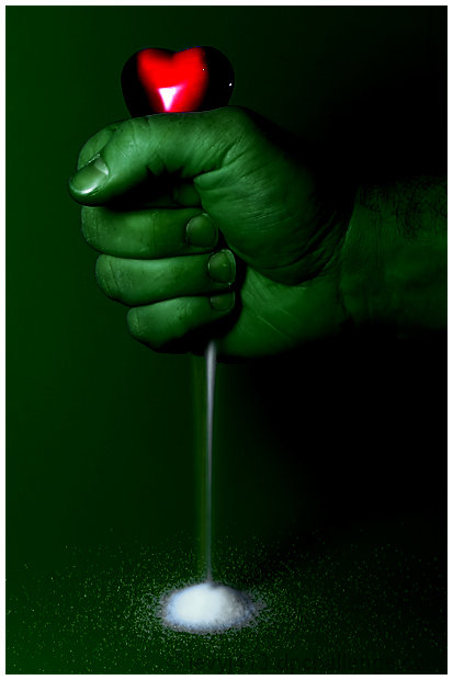
First, this is my first attempt to use colors far outside reality to tell a story. It was fun trying to do this in Basic Editing. For one thing, the heart is really a deep blue. I knew going into this that I wanted to change it to red, so I chose a green background to let me isolate the heart with a hue/saturation layer.
Second, I don't usually use borders. But here, the thin white border seems to echo the stream of ground "glass" (actually sugar).
Third, I don't usually take shots related to dark emotions. I expect there to be some very ugly, violent entries, so part of the challenge was coming up with an idea that conveyed a negative emotion without turning to violence.
Editing: Mainly used hue/sat adjustment layers to change colors. My hand had a lot of red, so first I changed red to green. Then I changed blue to red. The sugar had no color, so remained white throughout.
Passed validation. :)
Here's the unedited version:
Statistics
Place: 14 out of 132 Avg (all users): 6.1516 Avg (commenters): 6.5789 Avg (participants): 5.7308 Avg (non-participants): 6.2656 Views since voting: 2030 Views during voting: 426 Votes: 244 Comments: 25 Favorites: 0
Greetings from the Critique Club. The following comments are in response to your request for a critique on your challenge submission. Please feel free to send me a PM concerning my comments.
The impact of this image is immediate and lasting. It is a clear portrayal of an emotion and, in the context of the challenge, I appreciate that this shows what envy cum hate is rather than showing an object of hate.
Creatively an improvement, in my opinion, on your inspiration photo...though they do not carry the same message. I think the color choices and lighting carry a great deal of the impact. I would, however, like to see a bit more tension in the fist so that it really appeared to be squeezing hard. It would also have a little more impact if the heart could somehow look more squeezed itself, distorted in some way.
I'll also make a minor quibble with the tiny highlights on the one side of the heart...they appear to be from a secondary light source which doesn't appear to be contributing to any other part of the image. Of course, outside of basic editing, they could have been cloned away but perhaps the source could have been turned off in the first place? The main reason they distract, I think, is that white is so important in your image. The white V-shaped highlight on the heart so neatly leads the viewer to believe the white crushed "glass" coming from the fist. So, though it may seem picky, the tiny white highlights are made even more prominent by the other choices in the image.
There really is little else to quibble with in this image. (I will say I disagree with the commenter who wanted to see trimmed nails...as I usually do...but since when does envy stop for a manicure?) Overall, this is very well done technically, creatively, in subject and in conception...and the votes and comments agree. Congrats on your high-placing image! Keep 'em coming!
What an excellent concept and expression of feeling! Awesome job. That's all I can say. I actually think this should have placed much higher than 15th.
Great entry, Jeffrey! One of my favorites of the challenge. I love how is seems there is dust coming from below the fist - makes me think of sand through an hourglass, reprenting perhaps the time it takes for envy to turn to hate? Anyway, very cool!





 Add photograph to your favorites
 Add photographer to your favorites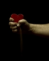


 Photographer found comment helpful.


