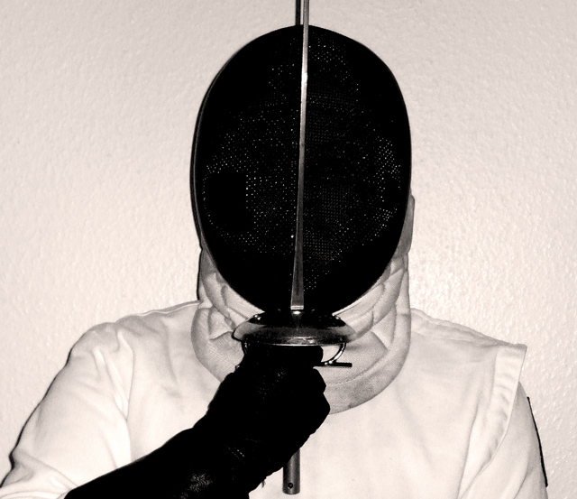
Taking this shot I realized that my room is much too dark and I have too many posters! Getting the black mask to not be see-through was almost impossible. It could have used some burning but I couldn't due to basic editting rules. *sigh* I will be glad when they do an advanced editting open contest again.
Statistics
Place: 97 out of 132 Avg (all users): 4.7591 Avg (commenters): 4.0000 Avg (participants): 4.6471 Avg (non-participants): 4.7929 Views since voting: 806 Views during voting: 311 Votes: 220 Comments: 7 Favorites: 0
This one had some potential, but you lost me in two areas: 1) i think cutting off the top of the sword was a mistake, and 2) the lighting is a little harsh, making the image a little flat. Some side lights to capture the texture of the mask would have improved this a lot.
3 because of the harsh direct lighting and kinda boring composition. Sorry. It would have been better without the flash (making it low key maybe?) or bouncing the flash (if possible) off the ceiling or behind you. Also, maybe move the subject away from the wall several feet?
I like the image a lot, but here are my suggestions:
Step back from the wall a little so that it gets blurred into a plain, pure white background. The I think the flat lighting is interesting, but I'd be curious to see it with dynamic side lighting--particularly if the sword were to be a physical divider between the lit and shaded sides of the mask. Because of this, it is important to keep the sword exactly vertical. Vertical lines imply potential energy which is what this piece is about. Potential, implied violence.





 Add photograph to your favorites
 Add photographer to your favorites


 Photographer found comment helpful.


