Greetings from the Critique Club
Meets the challenge? Yep. I think you did a good job of using an icon with universal familiarity to meet the challenge.
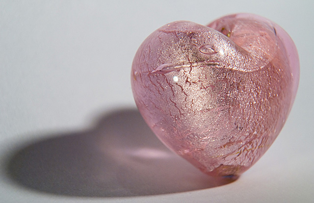
Techicals? You did a very good job with the lighting and using the macro to get good detail in the heart itself. Nice DOF chosen. There's on itty bitty hot spot on the heart that I'd have never noticed if I weren't critiquing the picture - in other words, it doesn't stand out. Color is nice and not overly saturated. The background is a WEE bit on the grayish side - a bit "whiter" might have given this a bit more spark.
Composition? I'll agree with two of your commenters - the shadow needs just a bit more room. I'd give a bit more room at the top, too.
Overall? I think it's a good solid picture, with good technicals. A slight change in composition to provide a bit of breathing room might improve the presentation. I suspect the "average" score is due to lack of the DPC "WOW!" factor, which I don't think is a bad thing - this is a nice, quiet, well-presented image. |







 Add photograph to your favorites
 Add photographer to your favorites

 Photographer found comment helpful.


