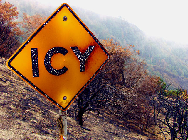
I took this while balancing on a gaurd rail on Higway 18 in Southern California. With lots of traffic behind, and a steep drop in front of me I used program mode.
Added contrast, removed brightness, and added saturation.
My wife spotted this fantastic photo opp, so half the credit goes to her. Thanks Theresa!
Statistics
Place: 55 out of 133 Avg (all users): 5.3261 Avg (commenters): 6.6667 Avg (participants): 4.8209 Avg (non-participants): 5.5337 Views since voting: 1253 Votes: 230 Comments: 18 Favorites: 1 (view)
Thanks for your comment, and your reactions are understandable from the way that you perceived it. I also appreciate you taking the time to understand the photo, even though you didn't understand the story as I was trying to tell it. That happens. I believe good photography should be subtle in it's story, and allow mutliple interpretations.
I loved not only the contradiction of the area around the sign (the black paint is actually flaking away from the heat) and the sign showing it had been ravaged from fire, then the outer edges of the frame showing no sign of fire at all, then of course the fog.
The propaganda portion of the photo is obviously just poking fun of the D.O.T. I personally was proud of the depth of the photo. Not only the tonality of the colors, but the story it told as well. The paradox from the burned regions to the untouched areas. How fire (and life itself as a metaphor) can be so indescrete, so arbitrary. Than the outer areas lined with fog showing the "mourning of the aftermath".
Now, there is no way I expected everyone to understand the story as I saw it. To me, that's what art is all about, that each person can absorb the story from a different perspective.
My problem, is all of the exremely low scores (three's or less). Empirically the photo deserves much better than that, and from my perspective these scores were given by people who thought it didn't meet the challenge requirements, so they significantly down-graded the image. It's unfortunate, because I feel like it's some of the best work I have ever done, and to get downgraded over politics is dissapointing.
It doesn't change how I feel about the photograph. I'm still proud to have it in my portfolio.
I saw your comment about this and I thought I would offer my 2 cents worth of feedback.
Artistically, the photo is good. This is despite at least one significant technical flaw, the bright overexposed sky (which may be totally fog, one can't easily tell here, as the bleeding of the overexposure into the trees could also just be the spread of the fog.) I really like the way you've composed it, just in terms of aesthetics.
However, the message doesn't really come through here. I see a sign, which says icy. I presume you are near a bridge (issue: there's no context for us here), but at the very least, I don't see desert (which would be funny). I really couldn't tell where it was, nor can I tell what the white marks are on the sign (either ice or pock marks). I looked at this a while when I voted, not sure if that was ice. Given the white tops of the branches of the tree just below right of the main part of the sign, and the white-ish color of the grass, I actually presumed this was ice/frost. And living in the northeast I am no stranger to frost.
Whereas I think you particularly liked this because you saw a contradiction, at least I don't see it, which lessens it's appeal somewhat. I felt it was fair to consider it a valid entry, as I could see a government program to convince us of the importance of believing road signs. But I don't think this image supports such a propaganda effort (nor one to the contrary even, again because of it's ambiguity).
Hope this helps you understand a different perspective on an image--something important here. I haven't been here long either, but I believe understanding how your photos are interpreted by other people is one of the values here. And by the way, I gave you an average score on this.
Sure I'm disapointed with this result. It obviously was hammered from voters not thinking it was a good example of propaganda, and didn't consider the over-riding quality of the image. All you have to do is look at the number of 9's and 10's it received, and it becomes obvious.
Hey, that's OK cause when it's all said and done this challenge pushed me to get this image, and I'm proud to add it to my portfolio.
The white specs are ice? Hard to feel the image justifies the title with just that little amount of ice. The background of the image appears to be warm and humid. Interesting tones on the sign however. 5 -danny
When I first looked at this, and because of your title, I thought the sign had slight patches of ice on it. But, then looking at the bushes in th ebackground I think theyve been fire damaged, so the sign now looks burnt (Hence the different yellow through orange colours.) 9
HAHA Cool shot, lucky too. Love this, very interesting. Well-titled, and fits the challenge admirably. Nice change from the heavy political stuff in the challenge. Congrats, 8!





 Add photograph to your favorites
 Add photographer to your favorites


 Photographer found comment helpful.


