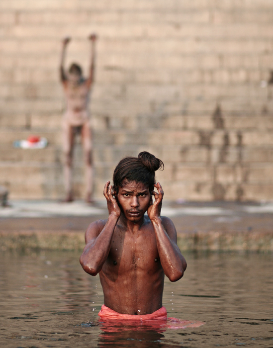
I really like the symmetry of the background figure and the wet stones on the R. I looked to see if there was a better crop.. did you think about half way down the upper L figure? BOth are powerful becasue his/her hands are up, but a lower crop really makes the main subject stand out.
I must really be missing something because I don't see how this could be any better. It looks perfectly edited with great rich colors, with a very appropriate enhancement of the harshness of the surroundings. How could you improve it? I think it's perfect exactly like it is!
haha i look at the pictures and looked at the guy in front...
i went back to look at the others when i realized i had totaly overlooked the background...
i looked at the back ground! hhaa wow....haha he seems happy :]




 Add photograph to your favorites
 Add photographer to your favorites


 Photographer found comment helpful.


