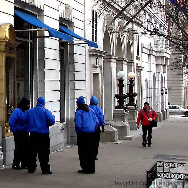
Not as sharp as I'd like it to be, but then this is a relatively small crop of a larger original.
First challenge entry edited using my new Graphire tablet.
The colors are close to those seen in real life, although I brightened them some. The artifacts some commenters mentioned in the grating in the lower right are because of my camera's imperfections. Normally they'd be too small to notice, but this is just the lower-right 1/4 corner of the original frame.
For people who notice it, the two lights really are different colors. I didn't edit one and forget the other.
Statistics
Place: 134 out of 288 Avg (all users): 5.5867 Avg (commenters): 6.5455 Avg (participants): 5.4336 Avg (non-participants): 5.7411 Views since voting: 975 Views during voting: 394 Votes: 225 Comments: 17 Favorites: 0
That guy in red has a lot of nerve entering that blue territory. The blue "gang" looks rather off-putting.
I really like the shot. The colors are great, the focus, light, and composition are excellent. There is interest in the subject matter. I don't know why it didn't score higher, maybe because it is too colorful for the average voters concept of street photography. I gave it a 7.
Well, for a shot scoring a 5.5, you have a lot of comments already, which is unique. I like the story that you can tell with this shot and the questions that the shot brings up. Who are the blue guys? Are they talking about the red guy? And the fact that the red guy is in motion towards them is great. The colors are vibrant, but not overdone. I like how the gold frame, the tree branches and the grating all sort of serve as a natural frame to contain the scene.
The first thing that jumped out at me was those 2 lights.. the b/w one and the color one. Editing error or the way the scene really looked? Looking at that made me start examining the edges of the rest of the photo to see if I could figure out how you tweaked the color, which is when I noticed the dark, sharpened edges around the men in blue. My guess is a bit too much sharpening since you said that the shot wasn't as sharp as you would have liked. And, as others mentioned, the lower corner is a bit sloppy.
Overall, a nice shot that I think suffered from a few technical issues. Hope you found this critique helpful!
Jeffrey, I love the great contrast in color between the jackets and everything else. Good composition. The thing in the lower right is kind of distracting though. I know it would have been hard to crop it out.
so i realize it's asking for a bit much, but for this to really work for me i need a stronger dichotomy. Like another group of workers wearing red. all in all, still a good grab
Is this for real?! If yes, what a catch. If not, what a fine job of PP. :D Did you do some manual blurring on the rails and snowpile in the lower left? Looks fuzzy over there...just an observation. One other minor thing that sticks out are the lamp globes - one is white, the other yellow.
Overall, a job very well done. Good luck in the challenge.
nice. Not sure how much you boosted the saturation but I think you overdid it a little. especially from looking at the artifacts in the bottom right corner. The background is neutral, the image would still have been strong with more muted colours.
interesting idea and colors matching / opposition with the red guy. And the almost B&W background is good. I would have cropped the rightmost side as the car brings nothing. And there is some color fringing problems with your lense (see bottom right bars).
This reminds me of my valet parking days, we word the exact same colors and would huddle around on cold days looking like a gang or something. We used to joke about being high priced car thiefs cause we'd all fly out of the van and jump into already running cars (expensive things too) and take off to the parking lot, I'm sure we got more than one crazy look.
I like the colors here, very nice image that keeps your eye on the subject but also lets you look around without getting lost.






 Add photograph to your favorites
 Add photographer to your favorites

 Photographer found comment helpful.


