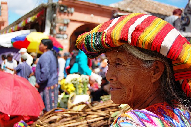
Composition: I like how the rule of thirds play well here. The ladies cheek line sits on the third and with the change in light...it lends well to this overall placement. The way the lady is looking into the image works well as does her facial expression. The vivid colour is very pleasing to the eye.
Technical: Whilst there is some blowout in the image, the colour definitely overpowers that, so that is definitely not a concern. The delicate touch of bokeh keeps the eye directed at the main subject which is obviously the lady. I know that the sun was high during this shot which lends me to another area, that was not in your control at the time of the shoot. I would normally like to see the face lighter than the surrounding subjects. This keeps the attention on the main subject for longer. If you look at the image you can see that you first notice the lady (which is quite dark) but then you are drawn quite quickly to the rest of the image. If you can imagine it being the opposite (where the lady is lighter than the rest of the image) then you can understand how this would hold the viewers attention more.
Overall: I feel you have a wonderful image that would grace a cafe wall anywhere. Good luck with your future imagery.
i understand that this was taken in the street...but it completely focuses on the woman. street photography to me needs to have at least 2 elements to juxtapose against each other. nice job bringing back her face from the shadow.
Not bad, although a lot in this image rests on the exotic flavour. This image is, probably, going to be liked by the DPCers. To me, this is an environmental portrait, not a street shot.






 Add photograph to your favorites
 Add photographer to your favorites

 Photographer found comment helpful.


