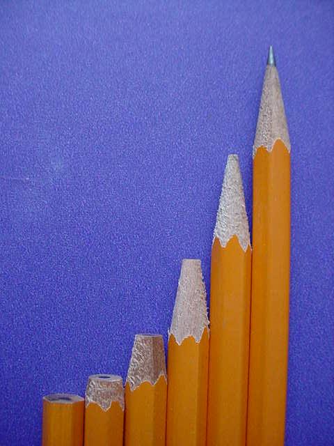
My first submission, I don't have a good photo editor - so I didn't use one. I lost mine the first time the computer died. Comments welcome - this is a new hobby for me.
Statistics
Place: 79 out of 185 Avg (all users): 5.5281 Avg (commenters): 5.7222 Avg (participants): 5.4412 Avg (non-participants): 5.6183 Views since voting: 1477 Votes: 267 Comments: 20 Favorites: 0
Great idea, terrific title. I would suggest some other lighting idea, so that the light is not straight on, which to me makes the photo seem flat. If you lit it from the side or bottom, it might be more dramatic. I think you sharpened them just right- very balanced.
You did a great job of lining up the edge of the pencils with the edge of the photo. This idea is great and I love the background. Now, I know this is getting picky, and it doesn't affect my score in any way, but ther seems to be a blemish in the background on the left hand side just over half way up. Like I said, doen't affect my rating, just an observation. The lighting is beautiful. I love how the yellow pencils seem to stand out on the blue background. Great job and good luck in the challenge.
Nice idea. I like the sweep of the curve. I think I would have focused on the tip of the final pencil and let the other ones blur a little instead of the reverse.
Like the textures and colours very much, though think the yellow would sing out more with a little more light on it. Would prefer if pencils were more accurately vertical. Kavey
Nice idea, but I think you could have done some things better. A little more light on the pencils would help them stand out more. Also, you might want to set them up a few feet in front of the background to give some depth. The tip of the pencils at the far right and far left are out of focus. This could use a little counter-clockwise rotation and you should save at the best quality that gives you a file less than 150k. There are some jpeg artifacts.
this is very original! maybe the background could have been a different color because its kind of an eyesore for me, maybe a little saturation in the colors would brighten it.
Good composition - leads my eye up the "steps" to the point of the sharpened pencil... which is then slightly out of focus. I'd like to see that in focus as the subject seems to be the tips of the pencils. I like the dof, don't get me wrong. Everything in sharp focus would just be flat....just needs to have the attention shifted.





 Add photograph to your favorites
 Add photographer to your favorites


 Photographer found comment helpful.


