I think it's apt that I saw the dichotomy between pop and art here, because that's how I think of your work, a struggle between the two... with many great results.
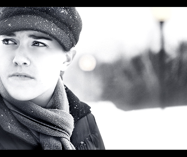
there are several shots in this challenge that seem more like portraits than street photos. This one is right on the edge. I can just barely believe it is candid if I try real hard. but then I see what looks like eyeliner. but then I realize it's probably a woman, and women are known to wear eyeliner. but she is lit in such a flattering way, and is just too darn sharp. in fact, this looks like a cropped Larus portrait, and a Larus portrait is the opposite of street photography. Then again, crops are important, they redefine a photo. And unlike Larus, your OOF background has elements that seem relevant to the themes of the photo: that moon-like circle, what looks like a streetlamp, wise white trees, piled-up snow. There is no debating that this is a good photo, just if it's a street photo. If only the eyes weren't so darn pretty and the scarf and hat weren't so darn sharp. But then I see those wonderful blown highlights on the face and how that connects the face to the snow. It's almost like this was a collaboration between Larus and an artist, and the artist had the last say. Yes, I think the artist won, and if I were to hold sharpness against you, then I would be using criteria as arbitrary and style-defined as any other. Okay, the artist wins, you win. Yay art! 8
Although it seems more like a set up, outdoor portrait, than a candid street shot, that can't detract from just how good a photo it is, and it really is.
The tones in this shot are perfect, really apt.
This is a wonderful photo. I usually hate these kind of borders (big and/or attention getting) but I find that it works well here. I almost get the feeling of a movie screen. Clarity, composition, DOF,tone all excellent. Love the expression. 10
i love the image size - better effect. good use of negative space - although the eyes are gazing away from it. nice composition. i don't like the black (superior and inferior) borders. 7 for me.
Not so keen on the high key - it just seems blown out to me though I can see why it might be chosen deliberately to emphasise the snowy environment and harsh light. I do like the composition very much indeed as well as the perfect blurring of the background - just enough detail remaining to pick out the light globes on their poles. Nice detail in her eyes and certainly makes me question what she's look at and thinking about.






 Add photograph to your favorites
 Add photographer to your favorites

 Photographer found comment helpful.


