Challenge:Hate (Basic Editing) Camera:Fujifilm FinePix S9000 Location: Dance floor in the dark, pitch dark Date: Feb 16, 2007 Aperture: f5 ISO: 800 Shutter: 1/125 Date Uploaded: Feb 17, 2007
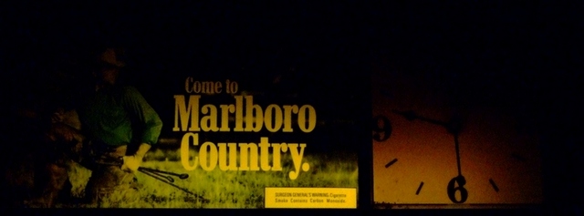
This is a picture I took while at a dance. I thought about the hate challenge. I absolutely hate cigarettes, but I also thought the clock was cool because it is very old and the lights were out in the corners. I hope you like but I know this is not bright and vibrant. Maybe you will hate it!!!! HEE HEE.
Jeremy
Statistics
Place: 128 out of 132 Avg (all users): 3.9140 Avg (commenters): 2.6875 Avg (participants): 3.7209 Avg (non-participants): 3.9607 Views since voting: 846 Views during voting: 310 Votes: 221 Comments: 17 Favorites: 0
Wow, looking at the comments you certainly drew out lovers and haters for this image!
Composition: Composition is ok but if anything it is a little bit centered. Your title refers to cigarettes so the clock is not going to be seen by many as an integral part of the image. What we see first is that big yellow rectangle on the billboard - right in the middle. Where to now our eyes say? Left to the rest of the billboard or right to the clock. Thats one of the problems with putting something in the middle of your shot.
Technicals: Lighting is both good and bad in this shot. There is a nice moody feel the way it is but it is not being used to draw attention to a particular element, rather it is just there, as it is. The image size also feels wrong - an almost panoramic style but we don't have a lot to see in most of the image.
My Feelings: OK, I wouldn't have voted quite so low as this ended up being but it was never going to score high in this challenge. Your thining was good behind the image but one of the "tricks" at DPC is to make sure your image fits within the "popular" definition of the challenge, otherwise you are going to get lots more of those "DNMC" comments and votes under 4.
I do too, but this idea could have been more creatively represented. A shot of a sign and clock with cigarette ads wouldn't have placed well in the challenge due to its lack of interest and uniqueness. But a half exposed one with white balance issues is doomed to fail.






 Add photograph to your favorites
 Add photographer to your favorites


