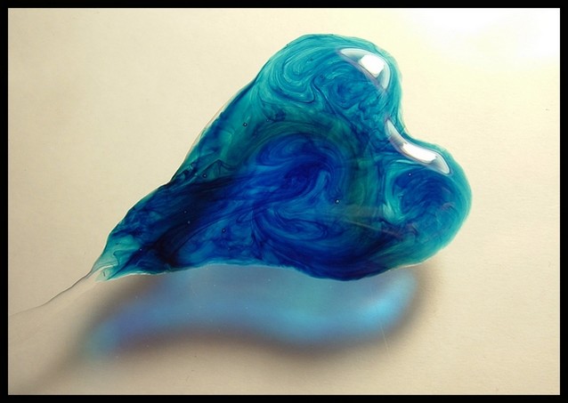
Composition: The image is laid out nicely with a strong diagonal form created by the heart. In a way I don't find the shadow of the heart a string part of the image so I feel that the heart is a bit far toward the top of the image. I realise the shadow is part of the image though.
Technicals: Some of the commenters have already referred to the brightness at the top-right and the hilights it has created. The hilights themselves are not a problem but when they are placed right beside such a bright portion of the background it becomes a bit much. The background in general seems to be a dirty colour which may hurt the image as the heart itself has such nice colouring.
Feelings: I like the heart and the shapes within in. It fits the challenge nicely.







 Add photograph to your favorites
 Add photographer to your favorites

 Photographer found comment helpful.


