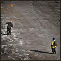
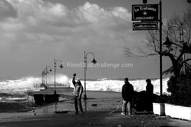
Composition: I can understand why you have kept so much sky (because of the sign) but I feel there is so much that has been lost. The vacant area really takes the viewer out of the image. You basically want to keep the viewer trained on your image for as long as you can. The activity in the foreground is great but due to the technicals, it is lost. Therefore, the viewer starts looking for other areas in the image. The waves are great...and I feel the image could really take on a whole new perspective if you cropped to the man in white and his surrounds as per the thumbnail below. Can you now see the lights have given the image a strong diagonal and the man directs the viewer up to the activity of the wave. There is no lost information or areas in the image.
Technical: Whilst I am not one to stick to the rules of the histogram curve, I do feel there is way to much dark in this image for the subject. I can't even read the sign properly and I definitely can't see the expression on the peoples faces. I can see some expression through their movement but it doesn't tell me much of the story. There are too many blanks in the storyline. If your tonage was a bit lighter it would lend better but I feel you were concerned about blowing out the water and that is why you went in this direction.
Overall: I think this image has a lot to offer but has been let down in some general areas. Your tonage and composition range was huge and you had a lot think about at the time of the capture. You handled it well but I feel there is a lot of room for improvement.
Nice capture, but I think that you lost a good deal of interesting detail in the sky with you conversion to black and white. I really like the scene here, but the shadow over the eyes of the subject is very distracting. I like the feel of anger from both he and mother nature, but that shadow really hurt.





 Add photograph to your favorites
 Add photographer to your favorites


 Photographer found comment helpful.


