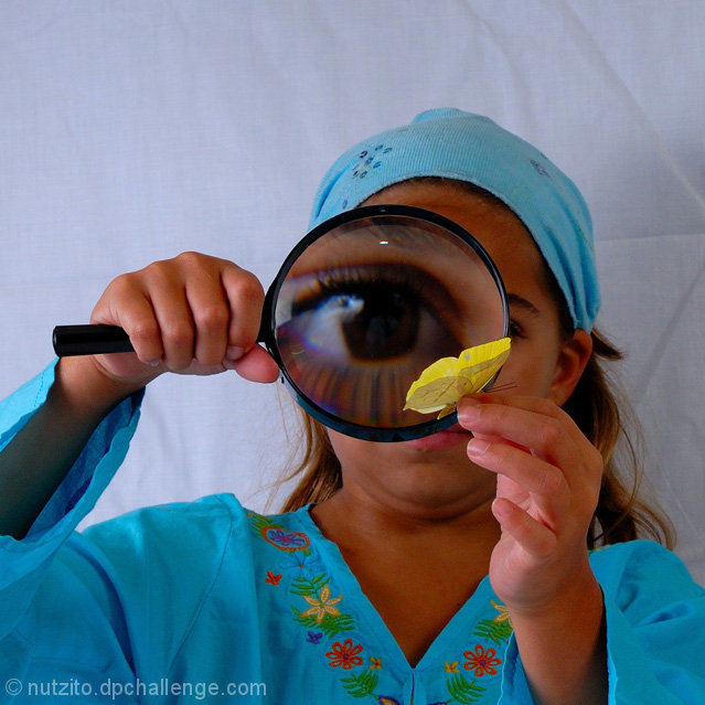
I like the way you set this up instead of just showing us the close up of the butterfly through the magnifying glass. I would have moved the girl further away from the sheet or ironed it first though, the wrinkles catch your eye too much.
I once tried a similar technique, but with considerable less effect. Clever idea and execution, and a bonus for including the physical sciences along with life sciences. : )
while it looks fun...I just want to be helpful here...the butterfly looks fake and the crease in the bacground cloth is distracting...I would have lowered the camera bit for better composition and worked a bit better on lighting...other than that, I love the eye and the whole idea 7
This is a great photo for the challenge, shame about the typo in the title....you should email SC and get them to change it, I've seen other people get their titles changed during the voting period......yay, I see you got your title changed.
I love the combination. White sheet in the background definitely removes distracting elements but might have been even better with a field or pond in the background. Eye is perfect.
interesting idea. the sheet in the background is distracting. needs either to have been ironed or to have been blurred out using a shallower dof. would be better if we saw just a little more of the girl's face as well. - 5
This is the most creative photograph in this challenge. The eye in the magnifying glass is spectacular and the color scheme is perfect. This would be a 10, were it not for the wrinkled backdrop (9)
Fantastic idea. The folds in the sheet in the background are really destracting though. Ironing helps. Also the light from the right is much stronger from that on the left and makes my eye draw to that corner instead of the really cool focus, her eye. More light on her face could help this.
I like the subject, but I'm not totally excited about the background-especially the wrinkle on the right side. It is a little distracting. Nice colors though.






 Add photograph to your favorites
 Add photographer to your favorites

 Photographer found comment helpful.


