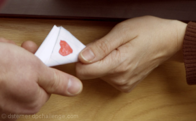
I just love this idea and wish the technical aspects would carry it better. Out of focus, yes...but also not much attention to creating a pleasing composition and lines. Also very shadowy and unappealing lighting. I don't mean to be harsh. Looking over your portfolio to make comments, it seems you love to take pictures! That's great! I hope hanging around here will encourage some creative growth in working on the basics like composition, lighting, and clarity. It seems you have some really good ideas, but need to take the extra time to double check these things. I'm no expert, so take my critique as you will :)
Ahhh, those were the days, back when everything was as simple as "I like you, do you like me? Check Yes or No." The shot sure could be in better focus, but I have a big smile on my face. Thanks for posting to the Take Your Shame thread!
Not even sure where to start with this one. If this is supposed to convey adolescence than you may want to use an adolescent for the hand model. These hands look so terribly aged that it doesn't make sense. On top of that, none of the image is terribly sharp, the not I assume is supposed to be the center of attention yet it is way out of focus. Last but not least, this does not seem very relevant to the category "Biology".
Cute concept but technically needs some improvement - very blurry and the color seems washed out; details on note (lines in the paper) have been almost entirely lost.





 Add photograph to your favorites
 Add photographer to your favorites

 Photographer found comment helpful.


