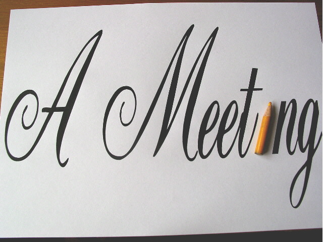
Composition - quite good Technical Aspects - very good Meets Challenge - yes Visual Impact / Originality – quite good/ high Other suggestions – I don't like the wood/table showing. Minor problem.
This is a great idea! very creative. You probably got lots of framing comments, so I will pass there. Did you want to vary the lighting from light to dark, left to right? If so, skip the next sentence. Suggestion: two lights from either side, nice balance. Nice play on words on your title. 8 Swash
Interesting idea - perhaps more of the table below or none at all (I think my pref would be none at all). Lighting a little uneven, seems darker at right. Kavey
Cute idea! The cropping is a little off, though. The dark table behind the white paper is a little distracting. You might want to play around with that a bit. Good luck in the contest! KrazyKat
I really wanted to give this a 10. There is humor, creativity, lighting is perfect. However, I wish the frame was better. I don't like seeing the edges of the paper. I could see this as a poster hanging in a office. I know shots from above are really hard to get, especially if you don't have a tripod. Just keep trying at it and take LOTS of pictures of the exact same thing. Great shot and good luck in the challenge. 9
Generally this is a pretty good idea! The only think I have to complain about is the pencil seems small compared to the size of the entire image. However it is depicted as the main subject of the image so I may just be complaining for nothing!





 Add photograph to your favorites
 Add photographer to your favorites


