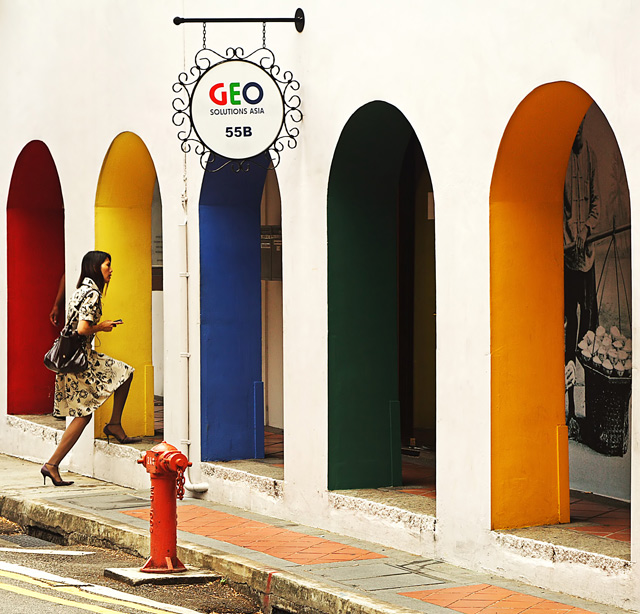
Okay, I really like this, and have high hopes for it (after my recent run of poor form). Hope I haven't overdone the curves, but it was necessary to get the feel I wanted. Not bad given that I leave for holiday tomorrow so circumstances allow me less than an hour of 'street photography' during the lunch break.
PP: RAW conversion focusing on getting the walls white, USM, curves, contrast mask, levels, neat-image, resize.
---------------------------------
Post challenge. Damn it feels good to do well. Thanks everyone for all the great comments.
Statistics
Place: 9 out of 288 Avg (all users): 6.8648 Avg (commenters): 7.5000 Avg (participants): 6.7250 Avg (non-participants): 7.0000 Views since voting: 3529 Views during voting: 482 Votes: 244 Comments: 40 Favorites: 7 (view)
I'm perusing and critiquing archive DPC street photography challenges to learn more about composition. Please email me responses to my comment if you like.
Now I want to go to Singapore.
Love the geometry and the repetition. This image obviously demands color instead of monochrome but i wonder what it would like without the colors.
Wow how did I get so lucky! I was just glancing through the Street Challenge top photos and just loved this one because the colors really allowed it to stand out. Congratulations!
Well obviously I really think "Rainbow walkway" is an excellent choice for this challenge. The image really grabs the viewer between the vibrant colors and striking lines. I think the best thing is how natural this looks, I can see people spending several hours trying to achieve something like this.
I was looking over the comments and honestly I can see the suggestions that were made but I really don't think it would have changed my vote. This is just an awesome shot! Congrats again!!
not sure if this will help, but i'd find this shot more stimulating if the girl wasn't there. i find the oddness of the partial graphic body and the partial man's body at the other end facinating
Interesting. I like the phase of the woman's movement, and I like the arches of the walkway. If there was someone exiting through one of the other arches, the shot would be completely surreal.
The sign on the top is too dominating. It would be better to cut part of it off when composing. Even more so because of the bright empty space above the arches. 7
This has such great contrast and textures. I think this is worthy of the analysis of a crime scene or a classic painting. The tall heels, dress and big purse easily represent affluence and there seems to be a juxtaposition of the rugged landscape and the beautified architecture along with the silky dress and fragile footwear. The character is captured at the perfect moment as she enters a seemingly friendly world of shopping or something like it. The edge of the street is rough enough for us to wonder where she had to travel to get there. There is one element that I think adds an extra level of intrigue and that is the arm of an otherwise hidden person in the red quadrant. The stepping woman looks as if she's expecting something and definitely cannot see this mysterious character in the furthest niche. A viewer of this work may wonder: "is she being ambushed? - was she told to come here for a job interview and this guy set he up just to hold her captive and torture her for a randsom from her rich husband?"
Two things I might try on this: One would be to darken the interior of the building. The artwork inside the building sorta brings this back into reality and takes some drama out of it IMO and could be easilly removed by darkening that entire area. I also thing the fire hydrant could be removed although it might not be fun to do so I can't blame you for leaving it in. In fact, maybe the hydrant adds another element the could be analized by someone greater than myself. These are pretty picky ideas I realize so please understand that they are each only removing .5 from your overall score = 9.
Wow, great colours and those arches really make a fantastic compositional image. Like the position of the woman entering an arch at the left and the details of the shop sign and fire hydrant break up the repetition.





 Add photograph to your favorites
 Add photographer to your favorites


 Photographer found comment helpful.


