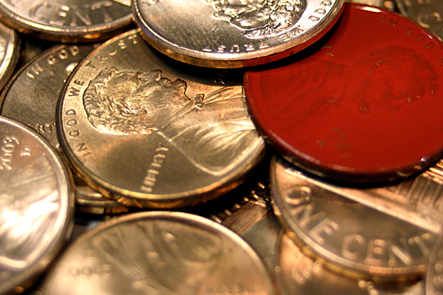
Hi! I really liked this shot during the challenge and still do. But there were a few things that jumped out at me right from the beginning. The first was the glare on the left, very distracting, a slightly tighter crop would have taken care of that. The light on the penny at the top is perfect, not glaring, not too dull. The red cent being off center does work for this shot but the right side getting cut off doesn't really work for me.
I also think a small border would really help this shot, sort of like holding all the pennies inside the frame.
Also the focus seems a bit backwards, almost as if the blur should be in the back and the front more focused. Or the entire shot should be focused since it is a macro shot. I would really like to see this redone and if you do, please let me know.
Good Luck In Future Challenges!
Deannda
DNeufer@stny.rr.com if you have any questions or want to discuss this further!
It actually looks red hot, but I guess that's not really the case. An interesting interpretation of the challenge, and a nice closeup. Could have used a little more depth of field, imho.






 Add photograph to your favorites
 Add photographer to your favorites


 Photographer found comment helpful.


