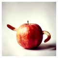
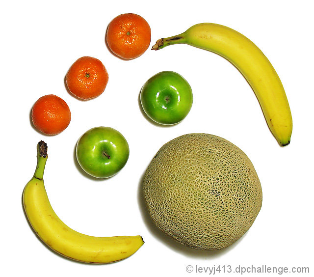
The technicals are pretty good in this picture. Great exposure, good contrast, and nice sharpness. I like the color palette being used, very bright and in your face. A good choice to go with the background.
I think this would have had more impact if it was straight on than titled. Don't know for sure, just a thought.
I think the biggest issue is that this is the typical staged studio shot. Nothing wrong with that in itself, but I think the art comes by making it look natural even though it is not. The elements here look artificially placed (which of course they are). While a cute setup, it is very unnatural. This is why I typically don't do "studio" type shots myself, it is very hard for me to make it look natural. A good attempt!
However, barring that one negative, it is still a well composed, has the great technicals, great color, and is fun/whimsy. This is the type of shot, that I personally would think about revisiting in a year and see if your "style" becomes more prevalent in the picture.
I see faces. Blink Jeffrey, it won't blink at me. Very fun image.
See you soon. I'm looking forward to seeing the wonderful world of DC thru your eyes.
Jeffrey, when voting I found this to be a solid entry, though maybe not inspired. I do think it has a humorous appeal, especially with the banana ears, but the overhead lighting is pretty harsh. Kudos for the diagonal composition, adds a creative touch.
edited for my lousy grammar :-)
Nice color, sharp detail, nice clean background, and cute. I thought this would have scored better than it did. It's just so hard to figure out what the voters want.
I like the colour and the composition of this, however I feel it is let down by the blown highlights on the top of the apples and satsumas.
As I can see some dark shadows at the edges of the friut, I suspect that this was shot on white paper, rather than a light-table, and some post processing was done to acheive the brillent white background. It looks a litte too cut & paste for my taste.





 Add photograph to your favorites
 Add photographer to your favorites

 Photographer found comment helpful.


