|
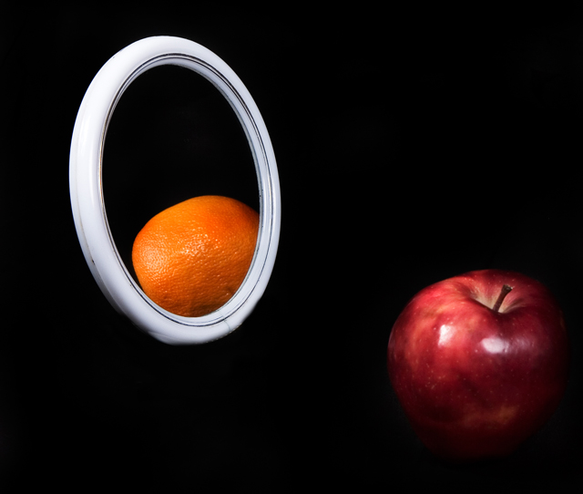
That's great! Love the idea you present in this composition - comparing apples to oranges! Very creative and original! Composition is good but it needs improvement in the lighting and attention to details category to push this out of the slightly above average and into the exceptional category. First off, lighting. On the orange and the mirror they are perfectly illuminated. On the apple, however, it is not. The right half of the apple fades off and disappears into the black background (at least on my monitor it does and I have pretty much calibrated it to see each square on the DPC light to darkness bar at the bottom of this comment box). I think that if the viewer could see the full shape and hard outlines of the apple it would improve the visual impact of the photo. Either another light positioned at a 45 degree angle to illuminate the right half of the apple could have been used or upping the gamma slightly could work (but you may loose some of the tone of that true black background). Next, the devil is in the details - we see the stem of the apple but we don't see that mirrored in the orange relfection. Seeing the green stem stump on the top of the orange would be the complimentary reflection of the apple with it's stem showing- something you would expect to be in a true reflection of the main object. But we don't see that here. |





 Add photograph to your favorites
 Add photographer to your favorites


 Photographer found comment helpful.


