i love photographs who uses focus contrasts such as yours. it's great how you have the flame line on the whole edge and not focused to much on one spot.good job
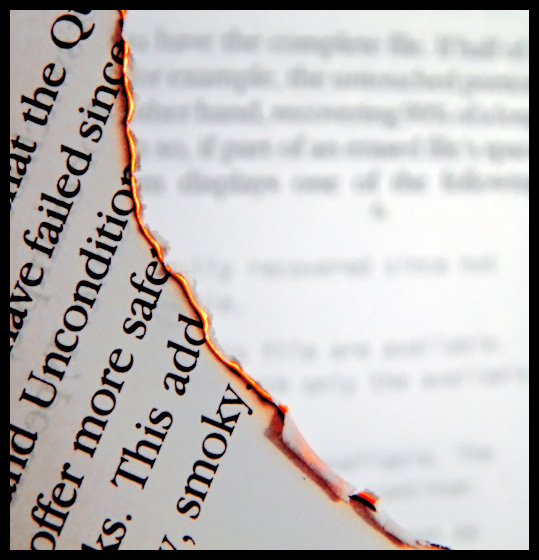
First your shot meets the challenge well with your title and edge of fire.
Your photo has great lines. You led our eyes right to what your subject is, the line of fire and possibly unconciously the word smokey. Having the line located where you did, is what I like the most, besides the nice contrasts.
Your dof is right on. The focus on the close sheet and off focus on background is perfect.
wow, great idea. heh, smoky- nice touch. very crisp- i gave you a 10. i have to guarantee this will be in the top 3. If not, i quit this site and burn my computer. (that was an empty threat.. i would never burn my computer)
Great photo.
Good job on the lighting, getting good exposure on the fore- and background well and to hold the glow in the small flames must have been a bit of work. I like it how you composed this, as well as the aperture choice. Good clean, detailed and good sharp text. When I think about my Before and After photo, I had a hard time to get the edges of the text right.....
I've read this book for my English exam (I'm Dutch) and enjoyed it. Good choice, good job!
very nice. That glowin orange line really pops out of the simple b&w composition, the curve of the diagonal really suggest how the paper is being eaten up. I like the DOF - havinf the suggestion of more pages in the backgound work well - 9
I like the curve of the burning paper and the capture of the flaming egde. I'm much less keen on your choice for a background - the white is too bright and, although I can appreciate the decision to go for a blurred effect, the blurred text is too uneven in layout to really contribute to a strong composition.
Absolutely fantastic concept! Great use of DOP. The small line of flames really defines and separates foreground from background. Excellent thematic interpretation!
Excellent job capturing the smoldering on the page edges. The background is a bit too white though. Maybe if you concentrated the light above the page in the foreground instead of below. That would have balanced the brightness and also avoided having the text from the back of the page from showing throught to the front. Also, a nice touch would have been to scatter a few pieces of carbonized paper scattered on the background. I do like the depth of field though.






 Add photograph to your favorites
 Add photographer to your favorites


 Photographer found comment helpful.


