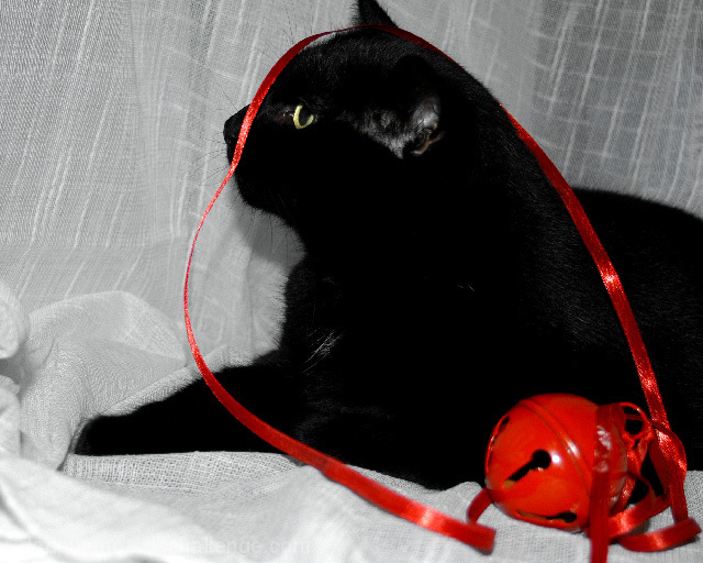
The red ribbon and bell adds a nice splash of color that adds impact to the image. The white background is a great contrast with the black cat, but produces such a wide tonal range that it is difficult to photograph well. And indeed, all detail is lost in most of the cat; it is just solid black, with no texture. Exposing the cat properly would have overexposed the background, but I think this would have been preferable.
The cat's pose is great and the image is well focused, although some sharpening would bring out the textures (where they exist). The composition is lacking in two ways. First, the picture needs more space at the top, both to get the entire ears and to provide vertical balance. Most importantly, the bell is large, bright, and red; it is the first thing the viewer sees in the photo and it holds his or her attention, stealing the center of interest from the cat. There is plenty of red in the ribbon alone to provide the needed impact; the image would have been better without the bell.
The red ribbon contrasted by the black cat, very nice. But I'm not sure it matches the title exactly. Perhaps if there was a red tint or something to it, or maybe against a red sheet.
I like this, but I think it could have been improved. not cutting the tip of the ear (if cropping off something or showing something partially, make it big enough to show its intentional) . I'd also like to see an exposure (difficult, I know) that shows the cat's fur or at least "texture".









 Add photograph to your favorites
 Add photographer to your favorites

 Photographer found comment helpful.


