I feel bad to submit this pic after what i learned from former two submissions and subsequent commentaries.
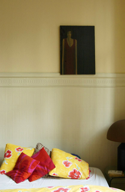
But this "light" set-up is more adequate then all the stuff i shot this day, just find this image reflecting the books' ambiance
Statistics
Place: 172 out of 231 Avg (all users): 4.9170 Avg (commenters): 5.0000 Avg (participants): 4.6508 Avg (non-participants): 5.1811 Views since voting: 1150 Votes: 253 Comments: 9 Favorites: 0
Dear Doc, thank you again for your time and effort: your behavour towards exellency is what pushes people like me into the right direction: putting myself into question and trying to act for the better.
Just for documentation: here's a temporary page on the net to show potencial customers what i do//www.users.skynet.be/panoman.
You will understand that my actual photography -exept for the panoramic- depresses me a lot, because altough i would want it to be creative and interesting, my mind is not UP to it, (life is in a hard phase just now). Well with the help and attention of people like yourself, it's feeling a good vibe from time to time and getting the right energy.
I haven't read the book so can't comment on how well this image reflects its ambiance. The painting is dark and somber, with the subject distorted and squeezed to one side. It is displayed in a light and cheerful bedroom. The combination gives me the feeling of someone who seems happy and balanced but harbors some hidden insecurity or depression. There are two centers of interest, the painting and the pillows. This is normally undesirable, but here it reinforces the dichotomy of happy outside and melancholy inside.
The natural lighting from the windows is perfect; it makes the wall more interesting but doesn't seem to touch the painting. The vertical format matches the painting and is the right artistic choice. Color was the best choice as well; the yellow adds to cheerfulness of the room.
Since you requested a critique, let me point out some weak points. The photo is somewhat blurry; I think sharp focus would have worked better. There is quite a bit of digital noise throughout the photo; it is fine on the painting but somewhat distracting everywhere else. And although the image says plenty to those who make the effort to look, it lacks some element to reach out and grab the viewer's attention. It's message is whispered, not shouted. This isn't necessarily bad, but will probably destine this image to obscurity.
The shot itself is great, the composition the lighting & all that jazz. Not sure that it fits the title as this seems to be a pretty nice place to be. JMO
This photo strikes me as odd. It doesn't really suit the title. The splashes of colour of the pillows and the lightness of the wall is okay. But the picture just lends an air of depression to the whole scene. I also don't like the cutoff lamp and the clutter on the table.
really nice. i like the painting and how the stretched out body seems to be continued in the shadows on the wall. Placement is also goo but i would have moved the lamp and bedtable out of the frame.





 Add photograph to your favorites
 Add photographer to your favorites


 Photographer found comment helpful.


