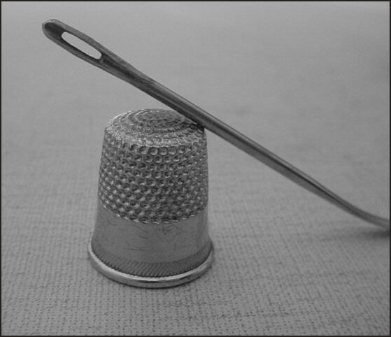
The very low contrast here doesn't help - it seems to be all midtones, no whites, no blacks. Composition is odd - why crop out the end of the needle? Such very simple subjects almost always rely on great technical work for their impact: try having a careful look at the impact of more directional lighting - this seems to be absolutely flat light - like in an office, or showroom. There's no shadows at all, no depth, texture.
Nice depth of field in this photo. I would have cropped out the part where the needle starts to curve... maybe it's just me, but it distracts me because my brain expects to see a straight needle, and then this one curves all of the sudden. 8
I like the composition, though I'd like to have seen a little more reflection from these metal objects. Also you might have wanted to crop a little off of the right. the curve of the neddle is a little distracting.





 Add photograph to your favorites
 Add photographer to your favorites


 Photographer found comment helpful.


