Number 2 means - it is for big boys, who can not close toilet seat.
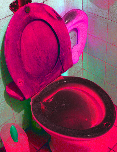
Picture must be with ugly colors, cause toilet training for adult could work this way.
What ever, i was thinking, this would be joke book, but ...
I think this is working in two contradictory ways: the hue shift is intriguing, making it look almost like a pop art piece - but then the dirtiness of the seat works against the stylised look of that genre. I think you fall between two stools here ...
Ah, the joys of potty training! I get to look forward to that very soon with my son and I can imagine my toilet looking like this very quickly, ICK! But I think this would have looked better with less pink and red and more white and black, perhaps black and white with a higher contrast? A 2
Whatever look you were going for here just doesn't work for me ... The colors are way too saturated and the pink toilet just doesn't look good anyway. The extensive amount of grain is a huge turn off, I'm sorry, this one doesn't do anything for me.
I dont know how to react to shots of the toilet bowl. It certainly meets the challenge & the book title goes well. I like that you shaded it to be pink, more closely matching your title which infers that boys also should be included (I think).
I don't care for the saturation in this photo at all, gives the toilet a creepy look and I am assuming that this is a childs potty training book, not very pleasing to the eye.





 Add photograph to your favorites
 Add photographer to your favorites


 Photographer found comment helpful.


