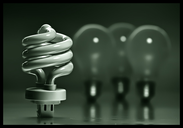
For the three bulbs in the back I used scotch tape to hold them up (taped from behind). The front bulb was able to stand on it's own although originally I tried to use one that had a roundish bottom like the back bulbs but even with tape it wouldn't stick so I just used this one instead from a desk lamp. Background is just some flexible poster board. I used one light source (desk lamp) positioned to the right with a white board on the left used as a reflector.
Editing:
Lots of noise reduction to get that smooth look and enhance the DOF. Shadow/highlights and curves used to tweak the tonal range. While I didn't really care for the green I felt it added to the "message" so I added that using a curves/channel mixer adjustment. That's pretty much it. All of my poster boards are getting bent and dirty so I think it's time to buy some more.
*Post*
I'm surprise this did so well. Thank you for the kind votes and comments.
Statistics
Place: 8 out of 195 Avg (all users): 6.5918 Avg (commenters): 7.7222 Avg (participants): 6.4928 Avg (non-participants): 6.6307 Views since voting: 1708 Views during voting: 330 Votes: 245 Comments: 28 Favorites: 4 (view)
Congrats on the high finish. This image stood out because of the excellent composition. The shallow depth was very effective. I like your choice of editing... the advanced NR as well as the tones.
A well done entry indeed!!!
The green colour disturbs me a bit, but it's just a matter of taste. Personally I would prefer blue for this subject. Great detail and DOF. I like your composition also. The ordinary three bulbs in the background are great touch. It would've been also great Personification entry (the bulbs are afraid or jelous :))
Not sure I like the green tones, but that's probably just me. I can see how green ties in with the environment. I do really like the dof. How the bulbs in the background are nice and blurry, but you can still easily make them out. I like the sharpness and lines of the good bulb. Overall I think it's a very good picture and will probably be near the top in this challenge. Good luck.
Very nice lighting (no pun intended). It may be a visual impression, but all the bulbs seem to be a bit tilted to the right, It would be good to see them perfectly vertical (7)
I like the tones but I think I'd like to see a little more contrast. Nice DOF of course. I love how these bulbs look photographed. I used one in my 30 day macro thing...
I like the idea and how it's shot. Not too keen on the layer of honey over it (but I know most would say yummy). Also wondering if the tilt was intentional. The tilt, I think takes away from the shot instead of adding any dynamism.




 Add photograph to your favorites
 Add photographer to your favorites


 Photographer found comment helpful.


