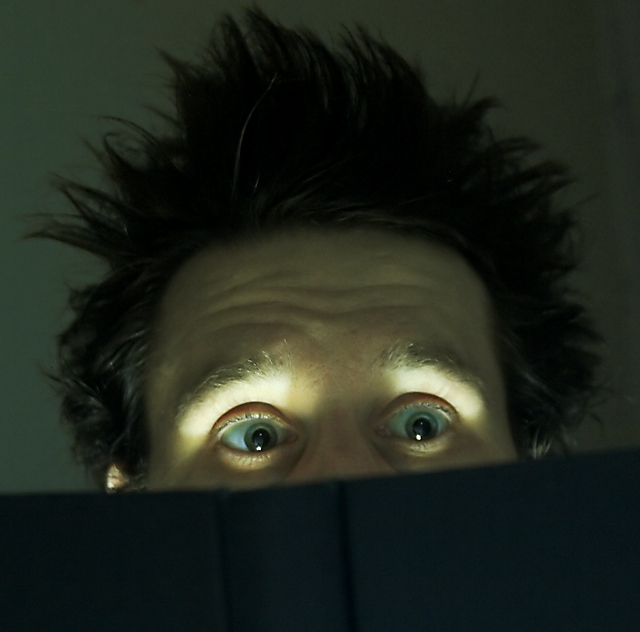
Oh how funny! Love this image. I wish you had allowed for some light to fall on the cover of the book so that less of the image was dominated by shadow/dark. The hair, the eyes, just say it all.
clever picture! I like the way the keylight highlights his eyes. There is also enough light to make out hte background and eveyrthing else. Very well done!
not a bad idea, I really like the shot you were going for here. I do have some critque though, you have your subject lite from under the plane of his nose. when you do that it looks like the subject is sitting around a campfire. Your color is also very green, some color corecting would have been some major help to this image. Your midtones and shadows are also very flat, a curves adjustment may also be in order.
that said there are some good things about this image too, it's compostion is really nice and the expression cought is very well done too.





 Add photograph to your favorites
 Add photographer to your favorites


 Photographer found comment helpful.


