I really don't get why this scored under 5 - sometimes the voters here are just dim.
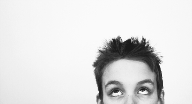
It is a wee bit over processed - you've got some posterization going on which saps the contrast a little, giving a sort of cartoony effect to it. I'd probably like it more if his head was more vertical. But the score most certainly does not accurately reflect the level of work here - the composition is bold & the eyes do a great job in communicating the emotion. This should have finished closer to 6 IMO...
I don't know why (and I know that's not helpful) but this composition disturbs me a bit. It would be interesting to see how it would change if you moved the head up just slightly to include the nose and the ears i.e. cut it off just above the top lip.







 Add photograph to your favorites
 Add photographer to your favorites

 Photographer found comment helpful.


