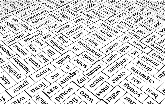
Magnets on the fridge - Paintin with my flash.. fired twice.
Little mark underaesthetic.... bother me.. need that spot-editing rule.... changed.. NOW! lol...its not the ccd... and I couldn't see it on the lens... after cleaning and blowing still showing up!!
Statistics
Place: 59 out of 109 Avg (all users): 5.6350 Avg (commenters): 7.8571 Avg (participants): 5.3108 Avg (non-participants): 6.0159 Views since voting: 1454 Votes: 137 Comments: 12 Favorites: 1 (view)
I like the unreal feel to this. I'm guessing you created this effect by bumping up the contrast quite a bit. It really works for you. Also, you have done a great job controlling your depth of field - each word is crisp and in focus. Also, your composition - the placement of each individual word - is very nice. I wonder what it would have looked like if you had shot the words right-side-up instead of up-side-down. Finally, I don't think that shot under "aesthetic" hurt your image at all - I had to look pretty hard to even find that word, and find your mark. If you hadn't mentioned it, I never would have noticed it.
there should be a random "fuck" somewhere near the lower left corner.. then i would give you a 10 :) it would've caught me off guard. although, i notice you decided to include sex... not good enough :) well.. now that i look at it.. sex, cigarette, drunk, model, and hard in succession is a kinda neat.
Don't know that I've every heard that a picture is worth a thousand magnets ... but I like this none-the-less. I think it would have worked better if it were flipped upside down so people could read the words better. You've done a very good job of keeping the entire field in focus even though it is obviously not a flat field!
Interesting try here, itsjust falls short of being super and ultra creative. add a color or dimension to this some how. bring me off the 2d black and whitewith a twist- turn one word around...something...
Did you deliberately set this up so that the words were difficult to read? If so, I think it was probably a good choice. It makes the veiwer look longer in order to make some sense of it.
Cool idea! I have these magnets as well :D I really like how you have them set up .. there is really something interesting about this photo, I like it.
Original idea. This tiling must have taken quite a bit of time to complete. I laso like the way you have positioned some of the words, such as in the lower righthand corner where you have placed "best" and "sex" together. Intentional?






 Add photograph to your favorites
 Add photographer to your favorites


