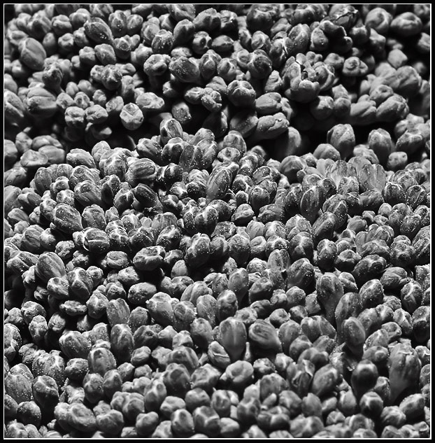
I gave this a 5 in voting. If it had been in color it would have been much higher. Knowing that it was a vegetable, yet having that grayish, blackish coloring made it very unappetising.
Nice abstract, but why B&W? I would imagine the color would have made the photo pop! What works for me is the division of the florets - maybe more of that would have pushed me to a higher vote. Also confusing are the white specs, not the blooms of the veggie, but the little specs as though a misting of water? - it doesn't "read" as mist. I admire the courage to enter "out of the box" concepts.
tight shot....i'd like to see it green. this may sound strange but i wish you found another part of the bud to photograph...that strong dark area at the top is distracting and i would have looked for a section that was a bit more random lightwise
I like the idea here but I wish it wasnt in b&w. I think the greens could have been sharp especially with a bit of dodging and burning to bring out the shadows and texture more. The b&w just feels a bit flat.





 Add photograph to your favorites
 Add photographer to your favorites


 Photographer found comment helpful.


