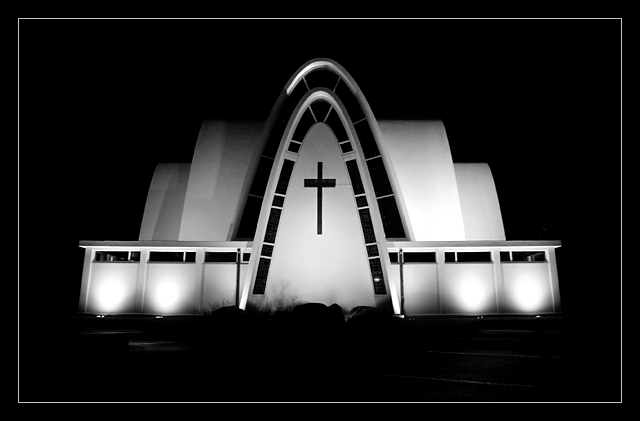
I like this shot a lot. Wonderful use of symmetric composition to emphasize the static architecture of the building. The B&W is well done too, removing the color further enhances the arching form of the building and the dramatic lighting without the distraction of color.
What a terrific shot! It makes the most of the unusual architecture with a minimum of detail. The lignting for this was just perfect - the negative space aspect of the shot works well to accentuate the subject. The choice of black and white was perfect for this.
Good lighting. Everything that needs to be seen is visible without any disturbing elements peeking through. The steps in front of the church are only slightly visible but in my opinion only adds to the quality.
I really like this. I think placing it in the center of the shadows/darkness works for this image. Black and white also compliments it well and emphasizes the simplicity of it. A nice clean, sharp image with a good matching border.
Haven't I seen this church before? From a different angle? Will have to check back after the challenge to see if it's the one I think. I like the angle of the shot and the curves of the roof. The lighting is just about perfect but the white border line is distracting to me. If the crop was on that line the shot would be close to perfect in that aspect. My gut instinct vote on this was a 4, it looked fuzzy and a bit dark at first but upon closer inspection I know now it was my glasses! EEK! :) Raising your score to an 8






 Add photograph to your favorites
 Add photographer to your favorites


 Photographer found comment helpful.


