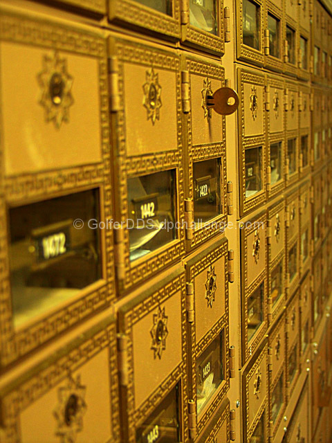
Good image overall; I would suggest you crop the first left column of mailboxes, while the perspective is good, the OOF degree is distracting, and the perspective distortion is high (it leanes left, whereas the others are straight). The colors are nice as is the idea, though I think this might have fit better in the infinity challenge or even the book titles.
You know what scares me about this, I recognize those mailboxes. They look like they are in a college mailroom. We even have those color and style keys. But then, I haven't seen the mail rooms of other colleges and this could just be a natural occurence of similar mailboxes. I like the message you give here. It's always great when you have the key to connect you with family, friends or even just the world. I wouldn't have considered it sacred but then, you get many of the same emotions here that you get in the church and elsewhere. Nice choice.
The tones and colors here are good at evoking a sacred mood. I'm not sure that mailboxes fit into the term 'sacred,' but I'll give you extra points for originality!
interesting interpretation. These ornate mail boxes do seem like something out of a church or temple. I like the addition of the key - makes me want to reach out and see if there are letters in the box - might be even more compelling if the key were closer to us. Perhaps a greater DOF so that the foreground is in focus too?







 Add photograph to your favorites
 Add photographer to your favorites


 Photographer found comment helpful.


