Thanks for the votes and the great and useful comments :) The white pencil blending into the white backgroud was intentional and I have been thinking about doing the same with the red one. I came to the conclusion that it couldn't be done without destroying the balance of the photo. By using extra lights there would be either shadows on both sides of the pencils (giving the photo a fake unnatural look) or hardly any shadows at all (taking the depth out of the photo). But that's just my personal thoughts. I did make an outtake with a black and a white pencil on which both pencils blend into the background, but it doesn't have the visual impact of this photo.
I love this photo! The red/white contrast is great! Good composition and lighting. Only flaw I see is the merger of the white pencil with the white area, while the red pencil is more easily distinguishable. -stephan
This is a GREAT photo---the ONLY thing I wish were different was the elimination of the shadows but I have no idea if that is possible. This is one of my favorites.
I think this picture is fantastic!!! I love the colors. It feels alittle sharp but I think it makes that picture look better. I love the backgrounds they turned out so solid. Great looking photot. Norm (8)
I enjoy how the white pencil bleeds into the white background. I wish that could have happened with the red pencil and red background. Sorry, I can't help you with how to do this - I am new at this.
This is just beautiful. Such striking colours and composition. If _looking_ for a criticism I'd say only this - the white pencil bleeds seamlessly into the white background - the red pencil doesn't bleed into the red background because of the shadows. But then, it wouldn't work without any shadows, as they give the pencils form and dimension, and the shadows would look bloody weird if they were on opposite sides for each pencil. So I don't know that it would be something you would want to change anyway. This is in my top three photos this week, very very striking. 9, Kavey
Wow, nice job! I love how the white pencil fades to the white background. I wonder if having an additional light from the right side could have given the same effect to the red pencil and eliminated the shadow from the white pencil.
From my perspective: Meets challenge:Yes Technical:very good Appeal/Artistic:very good Composition:excellent Originality:excellent Comments:Great use of color here! One of my favorites. Really, really good! Flawless in my book. 10! Good luck in the challenge. Grayce...aka...Gracious
This is really really cool. This could be a poster or an ad for something. It's very symetrical, however, the white pencil blends in with the whit background and the red one doesn't blend in with the red background. I realize that it's cause of the shadow, but it would be a really neat effect to make them both the same like that. Otherwise beautiful photo. Great job and good luck in the challenge.
Beautifully done. This is in my top five for the week. I think you will place in the top three. The colors are right on and the focus is superb. This would make a TERRIFIC logo for some company. In fact, I may know a company that might be willing to buy the rights from you. Congratulations on a great photo. 9
wow, what a great shot! the color is crisp and clear and it definitly jumps out at you. the red and white is a great combination. The shadows are the only thing i wish you could get rid of in this pic. otherwise its perfect!
Wow! This is really a cool photograph -- I love the symmetry, and how the white pencil disappears. I guess to be consistent I might like this more if the red pencil also disappeared into the red background. This might be a difficult thing to do (to eliminate the shadow on the right of the red pencil by changing the lighting setup). Great Job -- one of my favorites this week. LanSnake
one of my favorites this week. i really like the strong diagonals and vivid colors. my only wish would be that the white pencil had some "anchor" to the white side instead of blending in. thats a personal preference, though, and it is "your" pic. well done. ~mcmurma Aesthetics....8 Meets Challenge...8 Overall....8
This is a great study in color... I like the way you have composed and executed this image. I also like the shadows on the right side of the pencils... I thought about this and was wondering what it would have looked like if the pencils were lit from the right and left to remove all shadows, but I think the shadows offer some nice contrast here... good work! = 9 - jmsetzler
Defiitely creative. I love the white pencil against the red, but the red pencil gets somewhat lost what with all that white. Again, great creative idea.
Composition - very good Technical Aspects - quite good Meets Challenge - yes Visual Impact / Originality – high/very good Other comments – I'd also like to see a variation where the white pencil had a little distinction from white background
I like this. Strong, stark design, strong colors. Visually very pleasing. Good composition. Love how the white of the pencil seamlessly blends into the background. Although I'm sure you'll be getting comments of people who just hate that feature! My only nitpick is that the red point and tip don't seem all that sharp and have jaggedness and artifacts. Oversharpening perhaps? Good job.7 Journey PS: you might wish to consider some spot editing to clean up the red point (not possible for the challenge I know); it will greatly help this image.
Beautiful. The only thing that keeps it from being perfect is the lack of sharpness. (Sorry, I'm sure 20 people have already mentioned it, but it's the only thing keeping this from being my top pick of the week.)
High Contract; rich color; simplicity! I am going to keep this as an example to myself. I keep telling myself "KISS" (keep it simple stupid). I give this picture (and your presentation skills) a perfect "10."
If the tip of the white pencil could be pushed EVER SO SLIGHTLY against the red pencil, this would have been perfect. As it is, it's an excellent photo and a great idea. The shadows are somewhat harsh, but I still enjoy it.
TRULY AWESOME!!! I absolutely love it. great work - perfect. My fav so far. (ok, one tiny itty bitty thing, I wish the light didn't reflect so much in the grain on the red pencil) great composition - lighting is great - the exposure is perfect. 10!! Ruthann
Definitely my pick this week ! This is an absolutely awesome shot - perfect, perfect, perfect ! I'm sure you're going to get some comments about the shadows of the pencils - IGNORE those comments! Great work ! lhall-10
The small space between the white lead and the red pencil is the only minor thing I can find to talk about, so I talked about it. Great shot, even with all the good color shots this seems the best use of color itself. --10 Agamemnon
This is by far one of the better pictures this week. I really love the color seperation. There was one problem I had with this... there is a shadow on all parts of the pencils, showing definition, except to the left of the white one. Otherwise.... great photo!!!
I like that the white pencil blends into the white background, but I wish that you could have achieved the same effect with the red pencil fading into the red background, overall a nice shot though





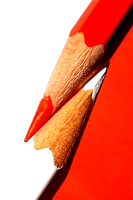
 Red and White
 See how this photograph was created!
 Add photograph to your favorites
 Add photographer to your favorites


