This is a challenge to critique! I'm having a very hard time trying to decide what to say.
My initial reaction is that it hurts my eyes. It is being very hard to focus on.
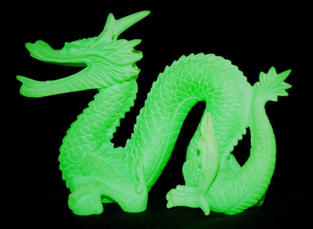
I think if you had a less straight on approach, adjusted the lighting to accentuate the texture of the item and pushed it back in the frame it would be more interesting.
Even though I can tell it is a 3 dimensional object it looses some of it's depth, again because of the lighting and angle.
I'm going to assume you used a very shallow DOF in order to maintain the black background. While a good technique, it did eliminate some the detail on the end of the dragons snout and the front claw.
The little bit of green reflection at the bottom isn't too bothersome. A little post challenge spot editing would fix that.
Have you tried playing with the Contrast settings, and levels?
The green comes over with a real mint feel to it. The figure is very prominent standing out against the black background. The bottom part is taking some qualtiy away from the image with the grainy green shadow showing out on the black. If this had been pure black the whole way round it would have been awesome, but I know how difficult that is setting up the lighting to do that. It is possible though.
Update: I commented on this on my laptop at home. Looking at the image again on my computer at work, the grainy green at the bottom isn't so obvious. Just goes to show you how different photos look on different monitors.







 Add photograph to your favorites
 Add photographer to your favorites

 Photographer found comment helpful.


